Sandoitchi, Sandwich Cafe
Sandoitchi is a well-known Japanese cafe in Sydney located at Darlinghurst and Chatswood Chase. With “Is more than just any sandwich” as their slogan, it represented passion and creativity filled with meanings, textures, layers, and colors. Came from the memories of childhood sandwiches, they believed that beyond a familiar bread, there’s a filling, and it’s where the creativity lies.
As they will open a new store, we were tasked to create a re-branding for them with the concept of Creative Spin on the Japanese Classic. This concept is inspired by the familiar form of Japanese bread and culture, where they wanted to bring comforting and personal feelings to everyone. By creating a new logo, packaging, and all the different stationaries we wanted to bring a modern and warm-hearted touch to the brand, whilst kept the original feel of the brand.
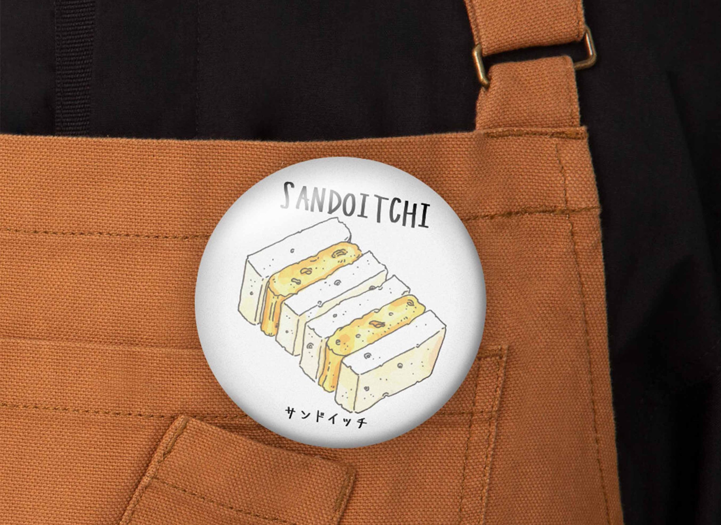
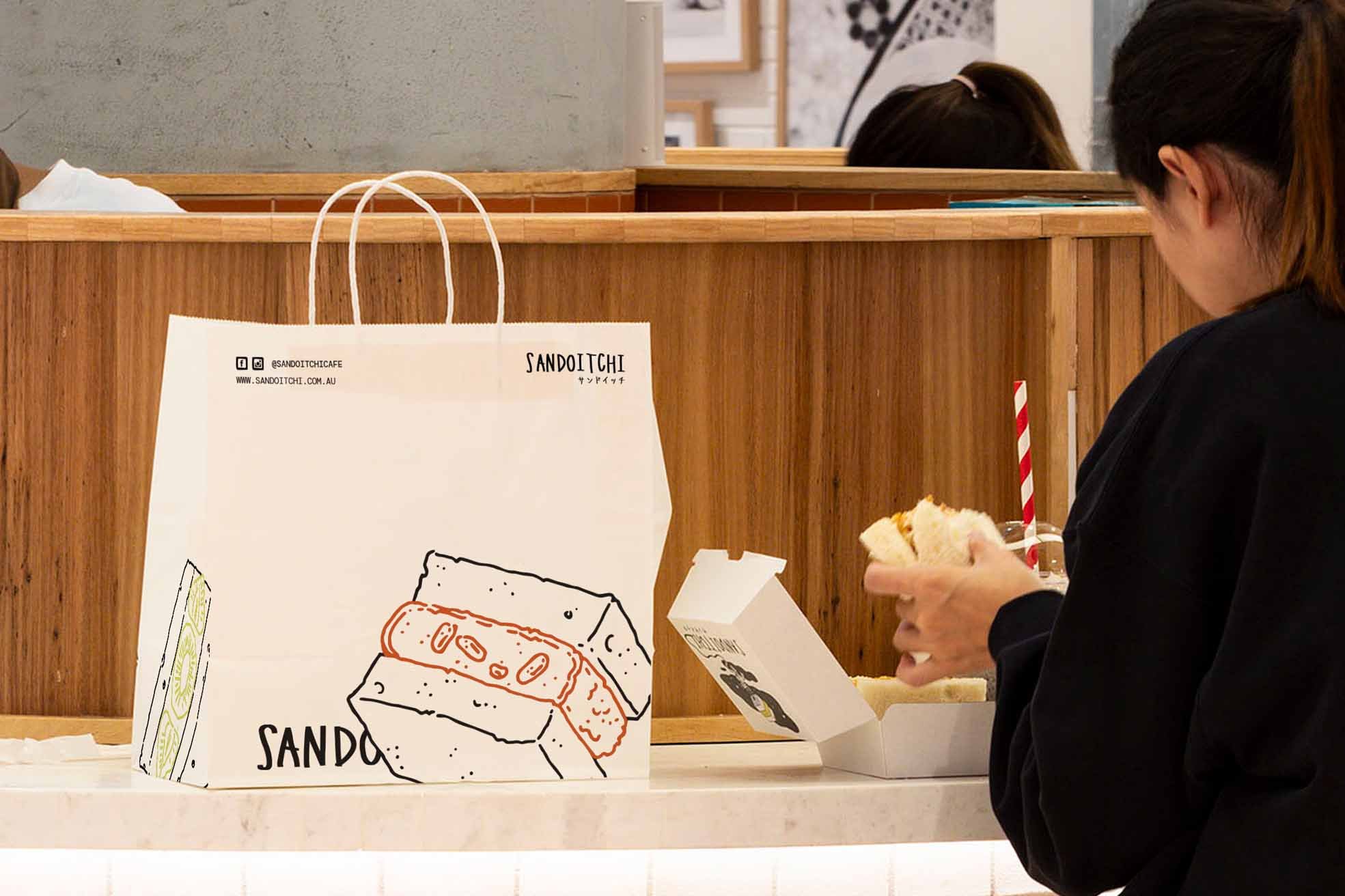
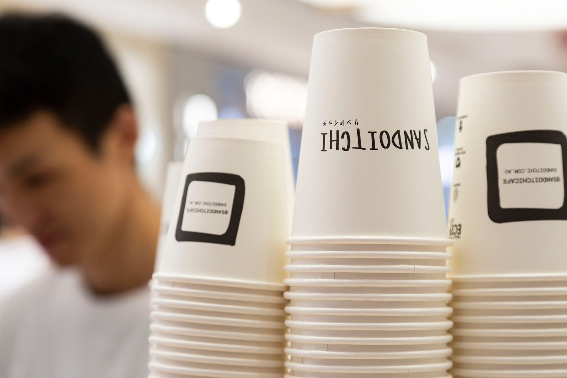
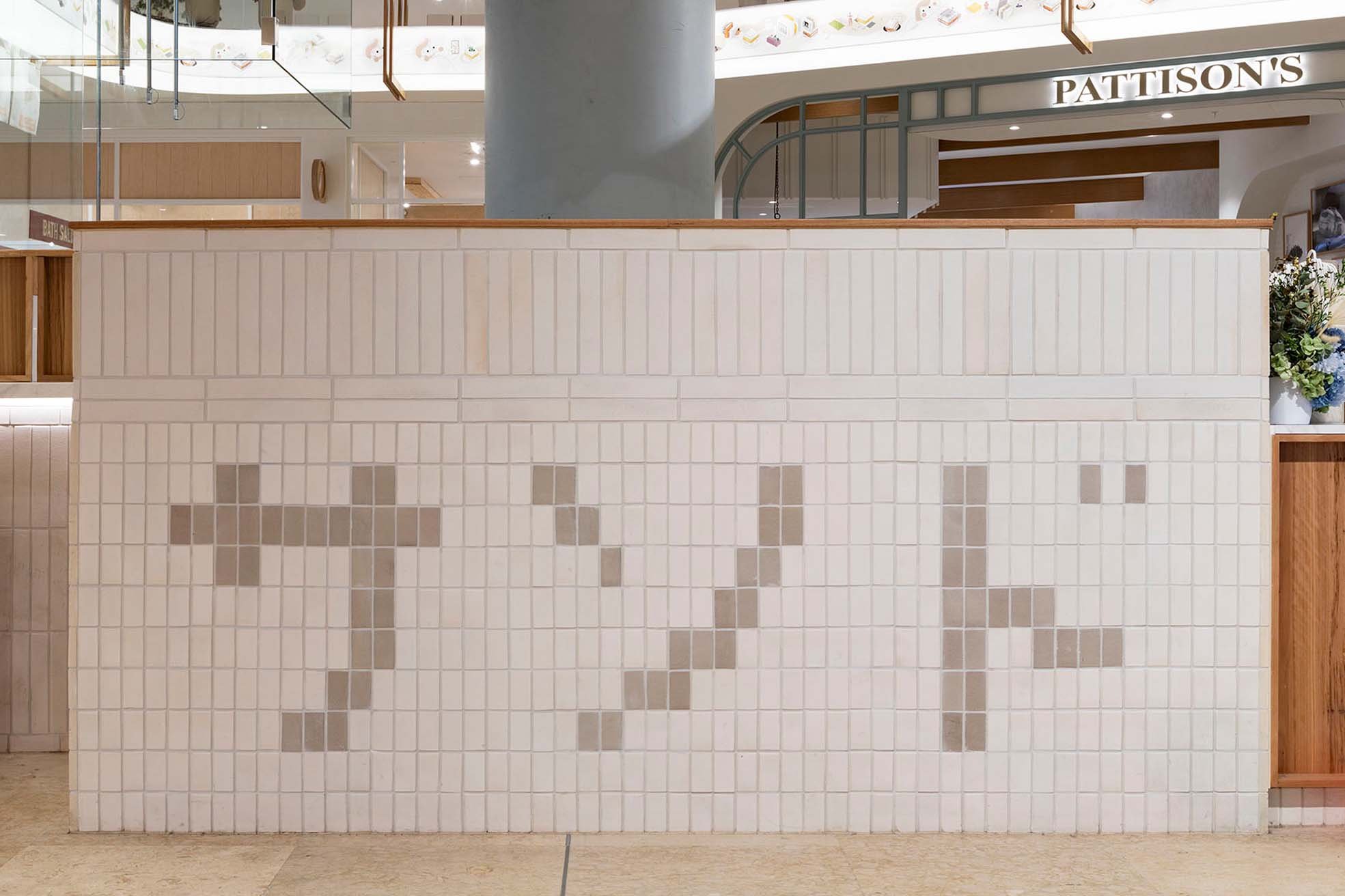
To give a hand-made feeling with a Japanese touch, we retained the existing logo, changed the font into a hand-written style of typeface, and combined it with the kanji characters. To add more fun variations to the logo, we created the stacked version which represented the sandwich. For a more creative spin to the logo, we added an ink-drawn square icon that mirrors the loaf of bread shape, with the soft inner square representing fillings. The icon was all about the deliciousness of fillings that represented Sandoitchi’s unique product.
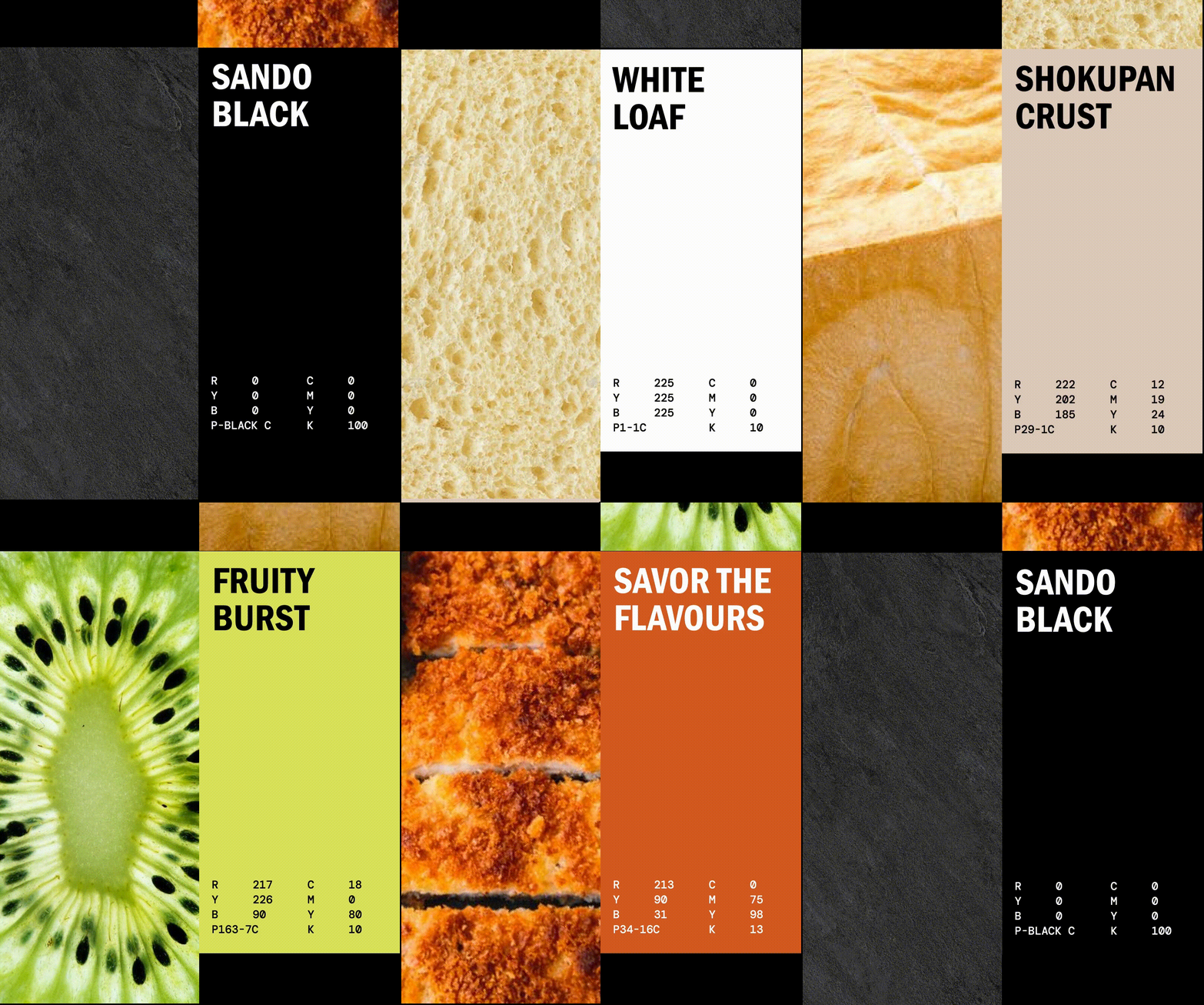
The fun and creative spin was also represented through the brand colours - with bold yellow representing fresh fruit fillings, and burnt orange representing savoury fillings, supported by natural material and texture that mirrors a bread that holds a fun filling.
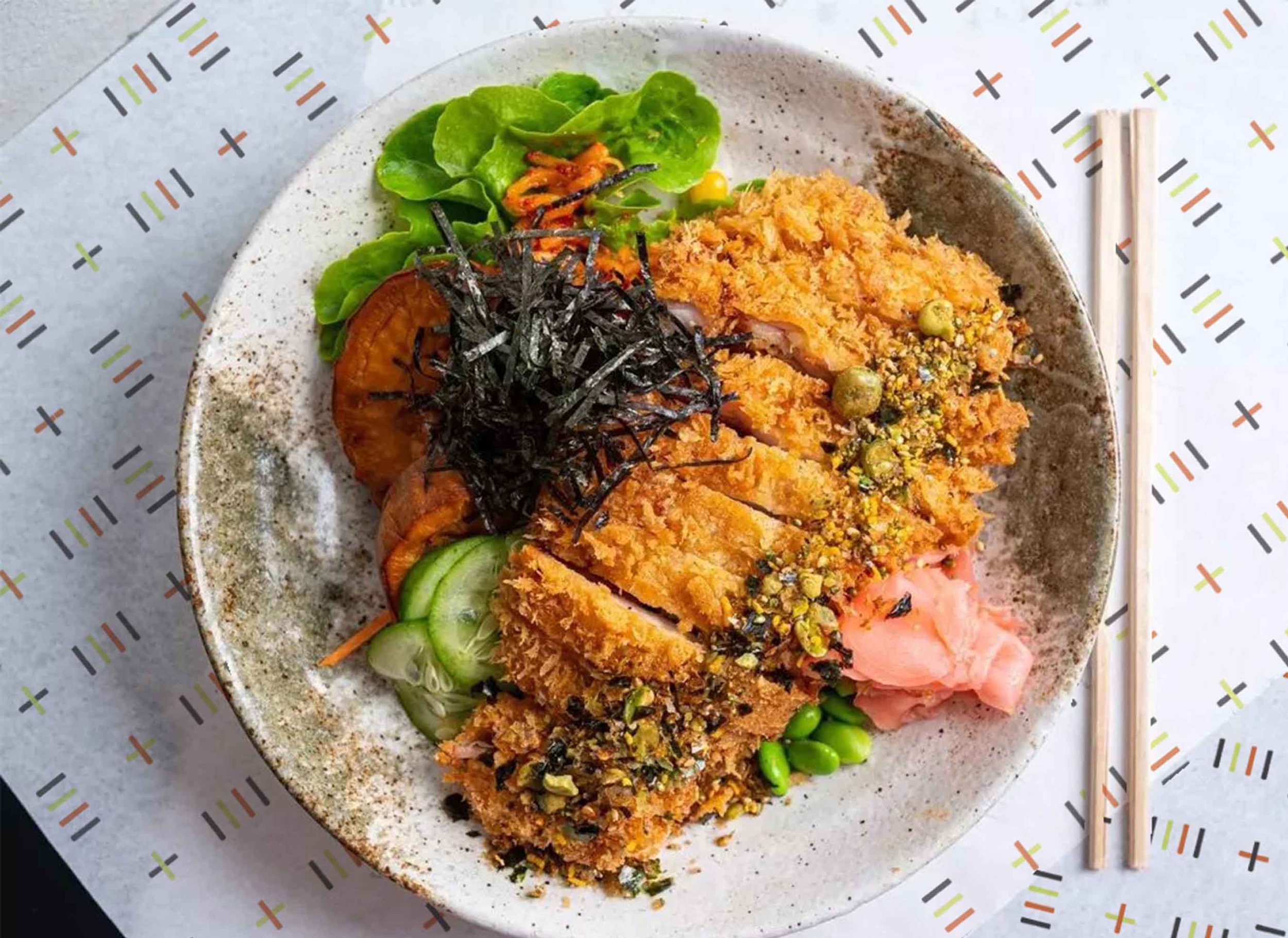
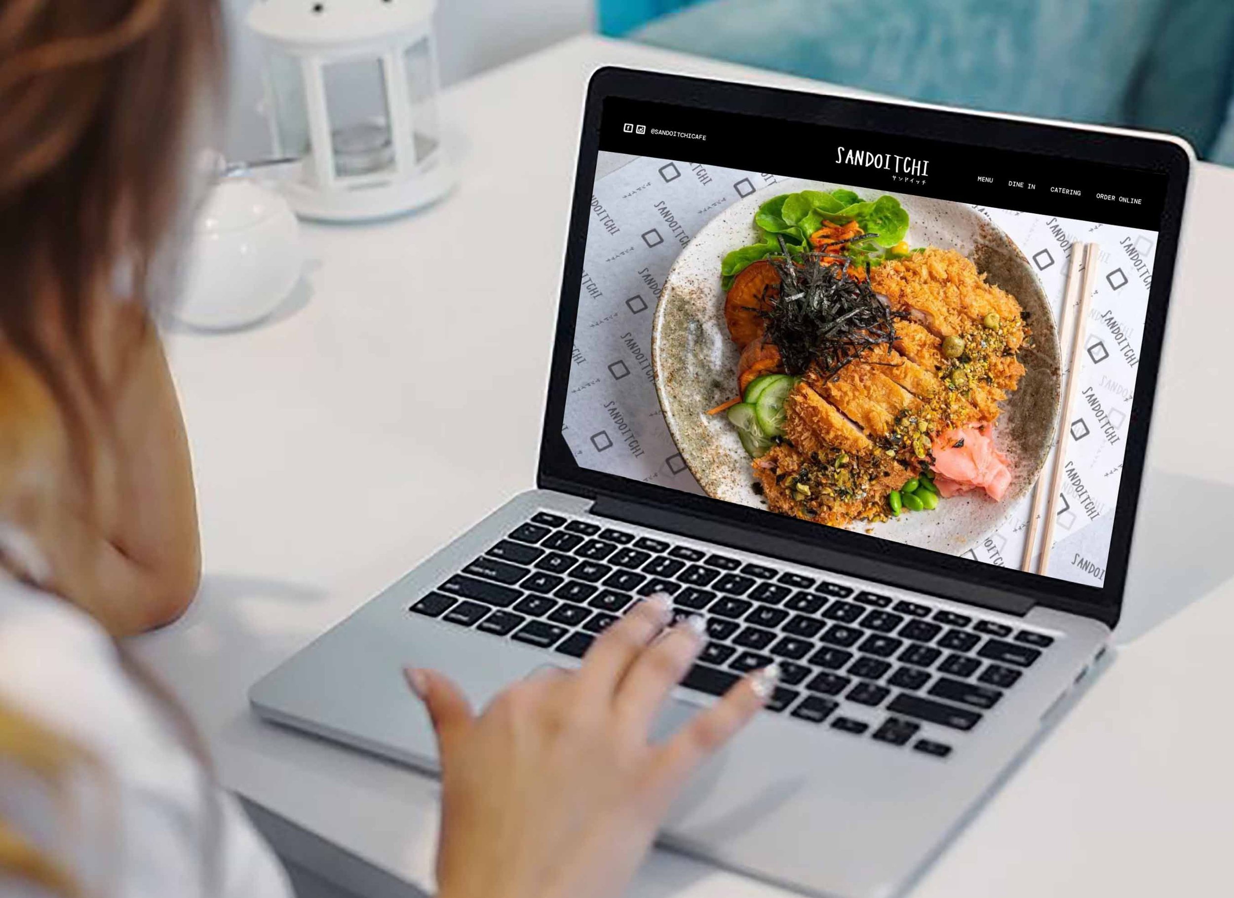
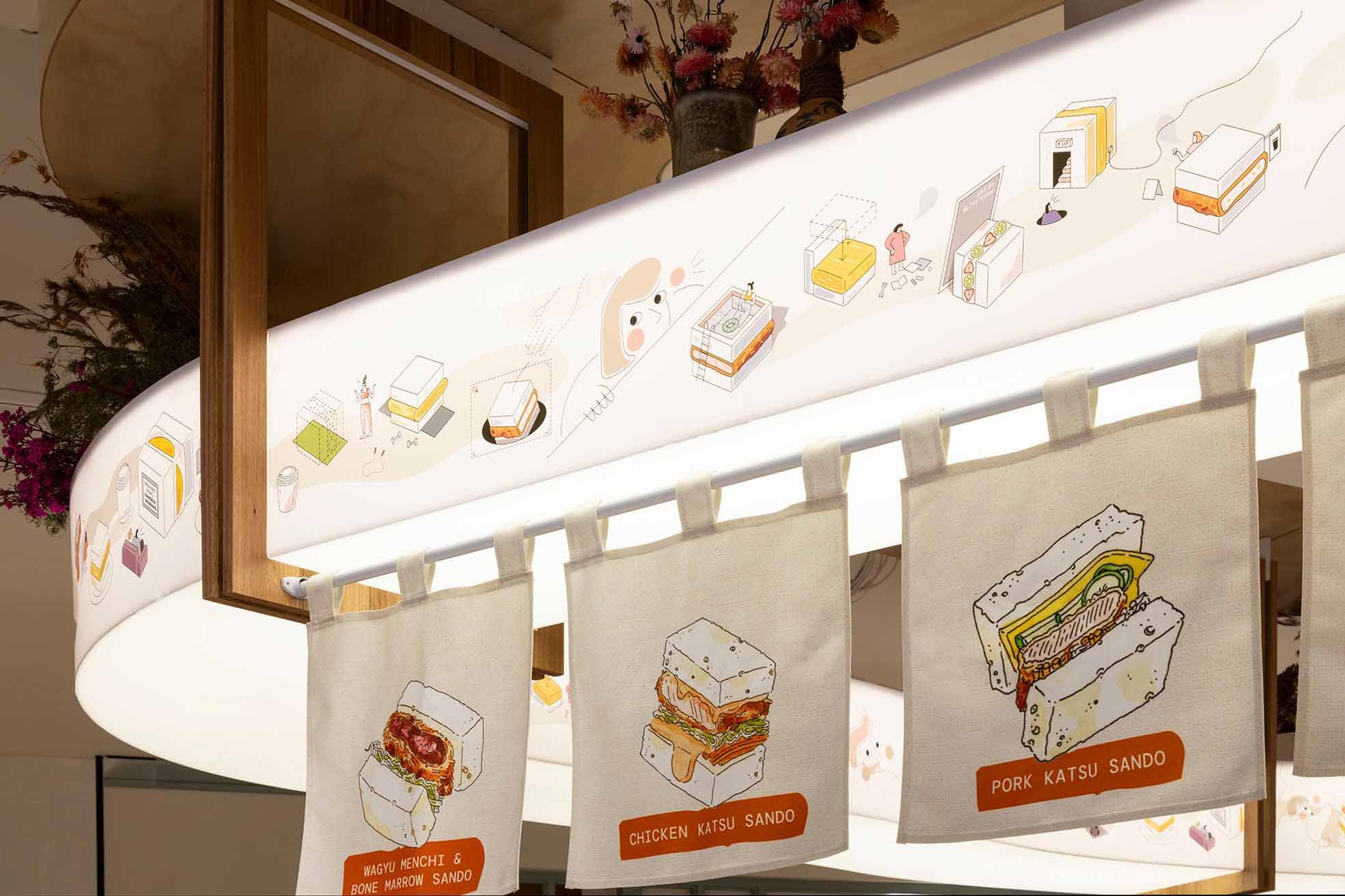
To add more elements, we created 4 lines that consist of 3 different colors, and we named them “the Sando lines",” as it was inspired by the sandwich. Because the icon is in black, we decided to use the same colour to represent the bread and used the bright color to represent the sandwich’s fillings where the burnt orange represents the savory fillings and the neon yellow represents the sweet fruit. From these lines, we created a pattern which is a plus sign to show that it’s more than just a sandwich. Additionally, to add more elements, we created a new line illustration of the products which was inspired by the previous illustration, where we used a combination of black color and a pop of color of fillings.
Sandoitchi Chatswood Chase
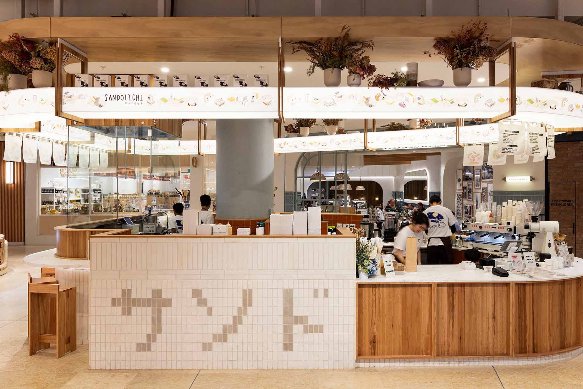
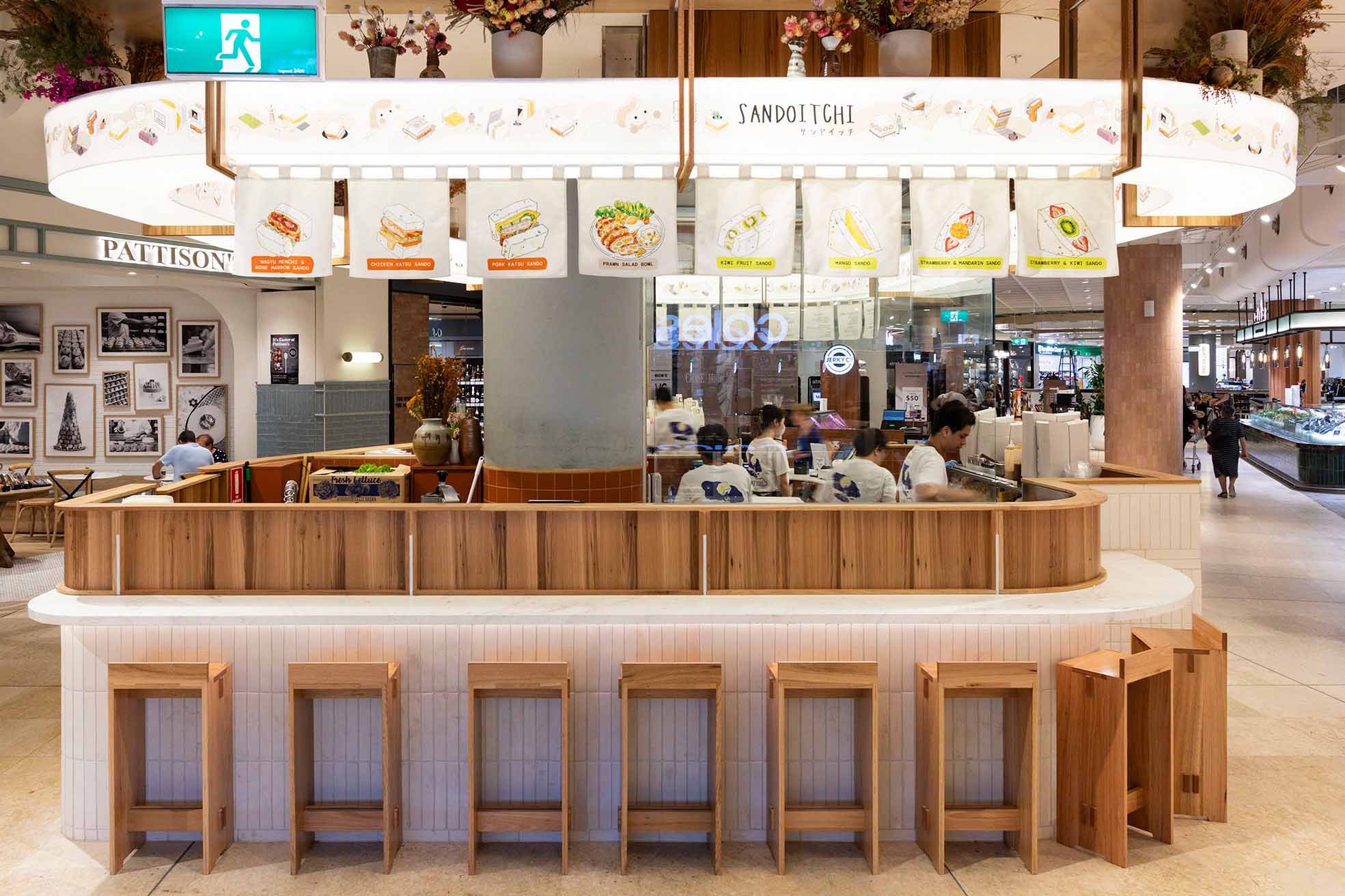
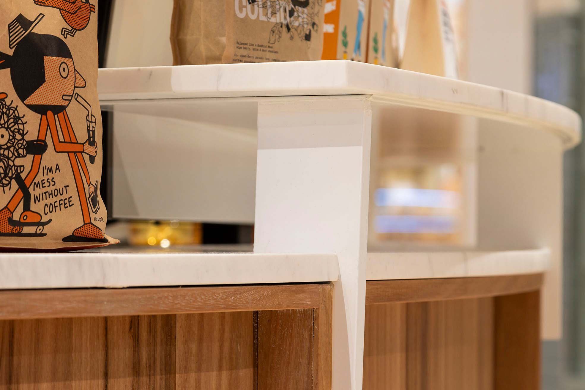
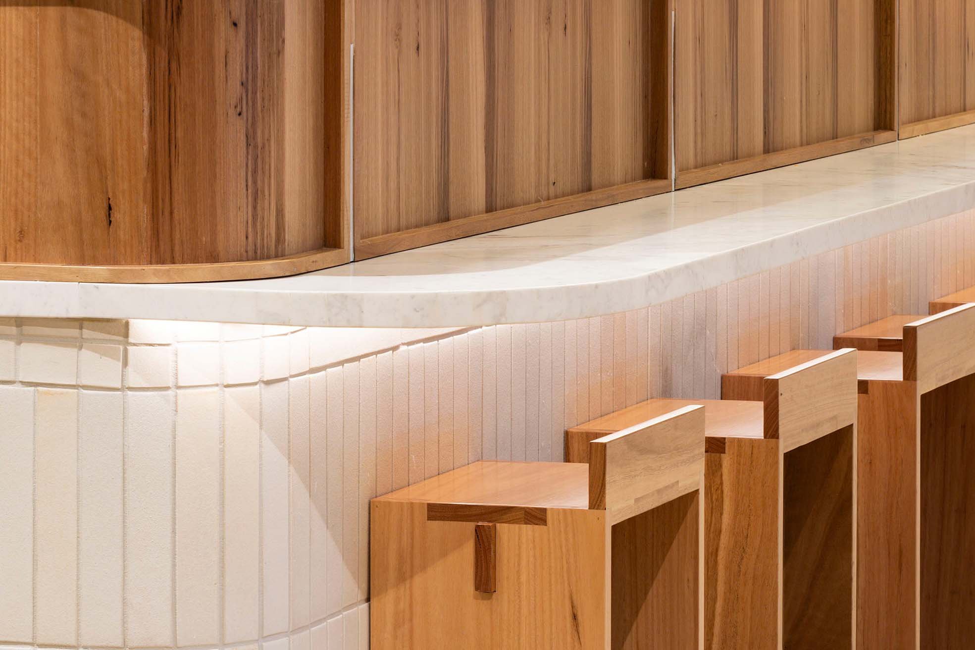
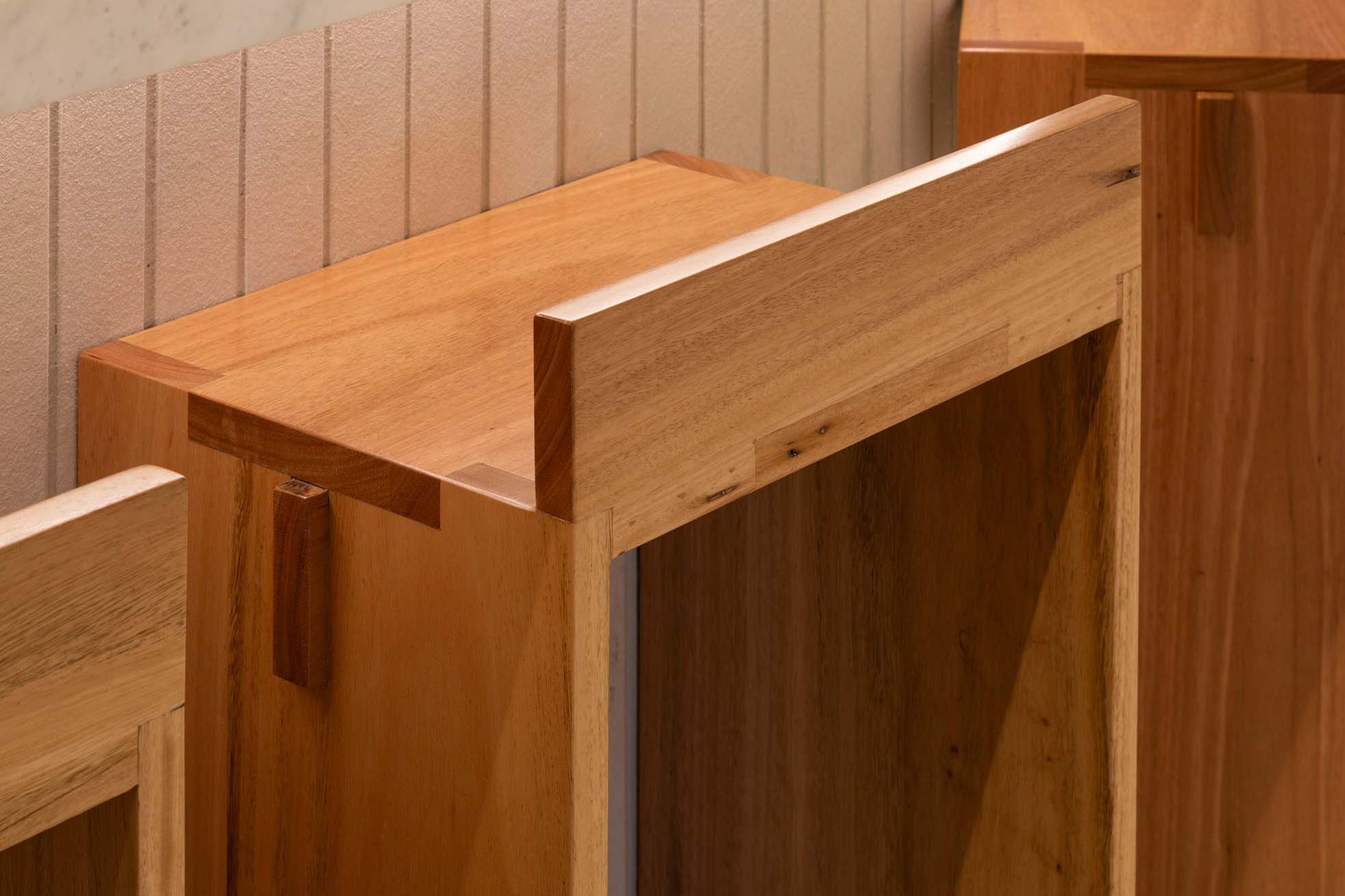
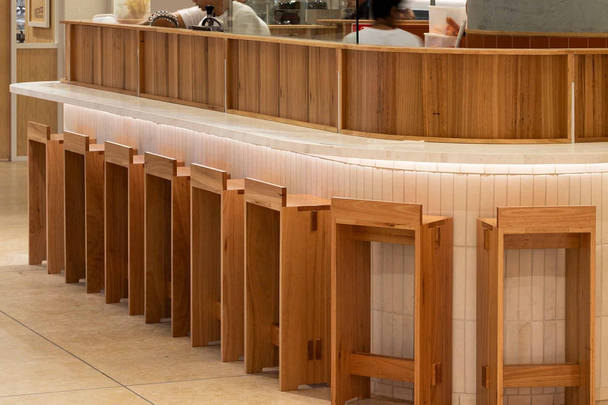
Unbox the Flavours of Happiness was the main concept for this Chatswood branch. Inspired by the sandwich box to package, protect and deliver happiness, the interior ambience will be articulated, surprising, and detailed. To create a Japanese homey vibe and gave a strong representation of the brand, the design of the counter and the sitting area was designed to be structured, stacked, and comfortable. Combined with natural, textured, and intricate materials and colour to achieve the whole warm and Japanese feel.
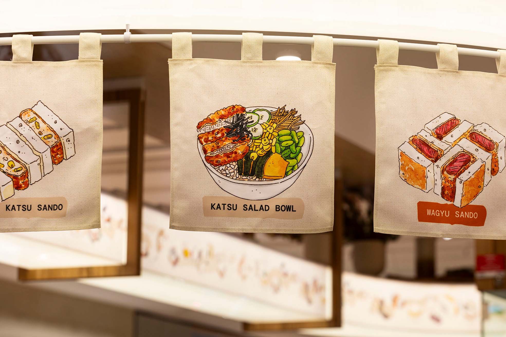
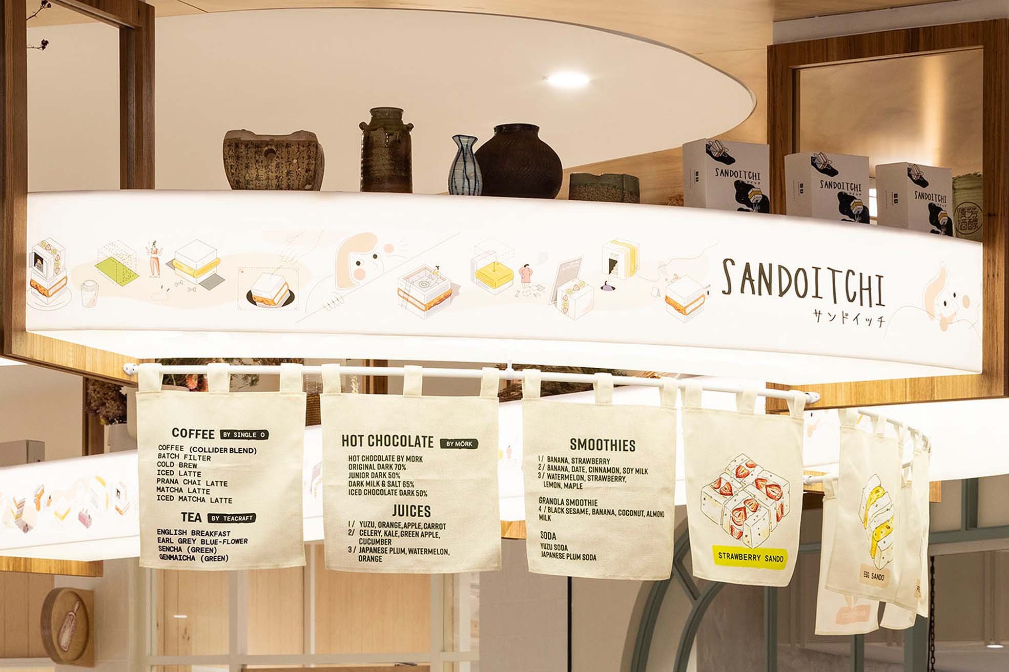
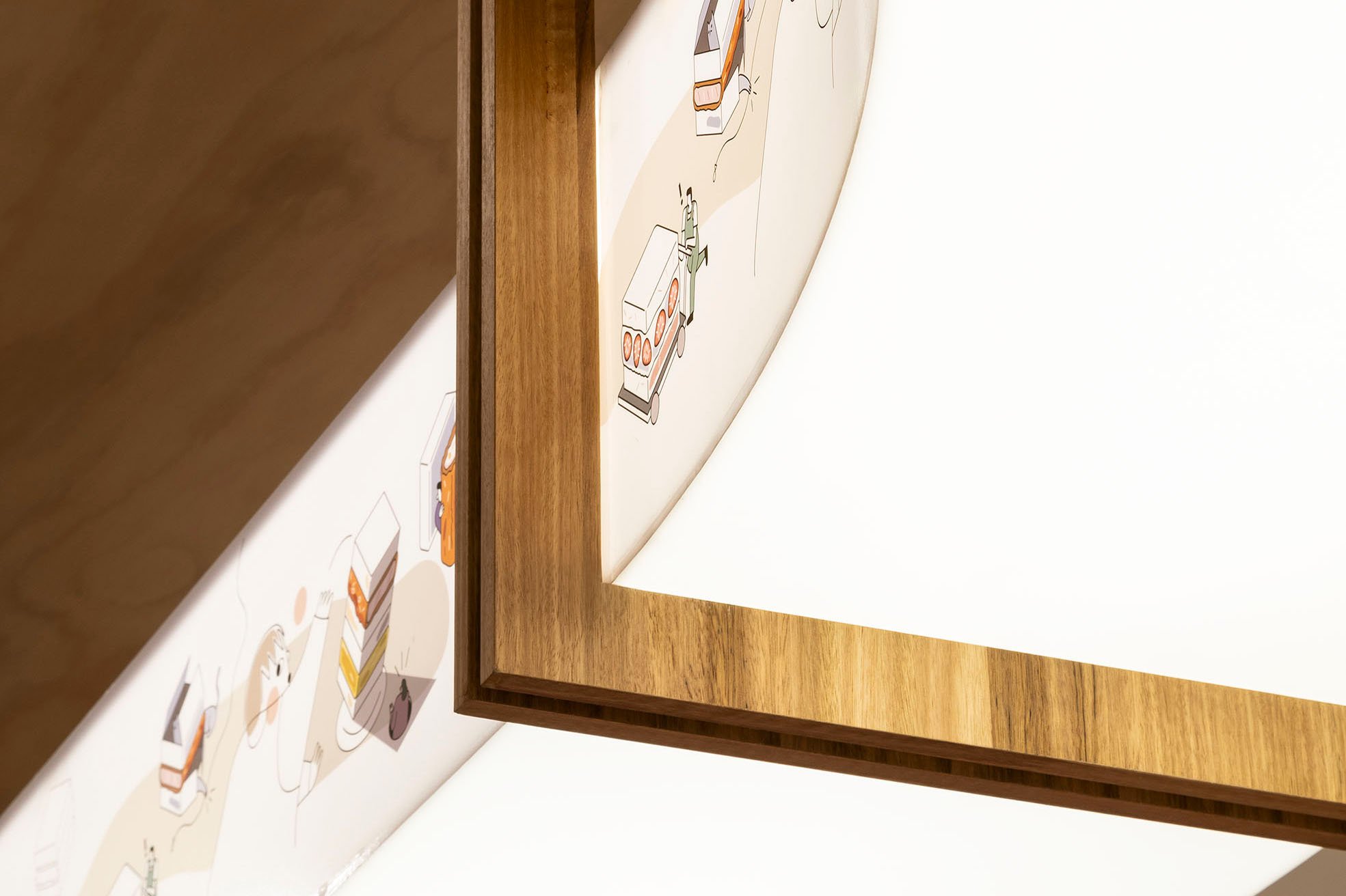
In Japan, most restaurants used Noren Curtain to show that they are open for business, hence this inspired us to create a hanging curtain on the top ceiling, combined with the food illustration to show the whole menu and made it looked interesting and appetizing.
Inspired by this project?
This space was designed by Vie Studio. Explore how we approach retail, hospitality, and corporate interiors, and learn more about the studio behind the work.


