Kou Ramen
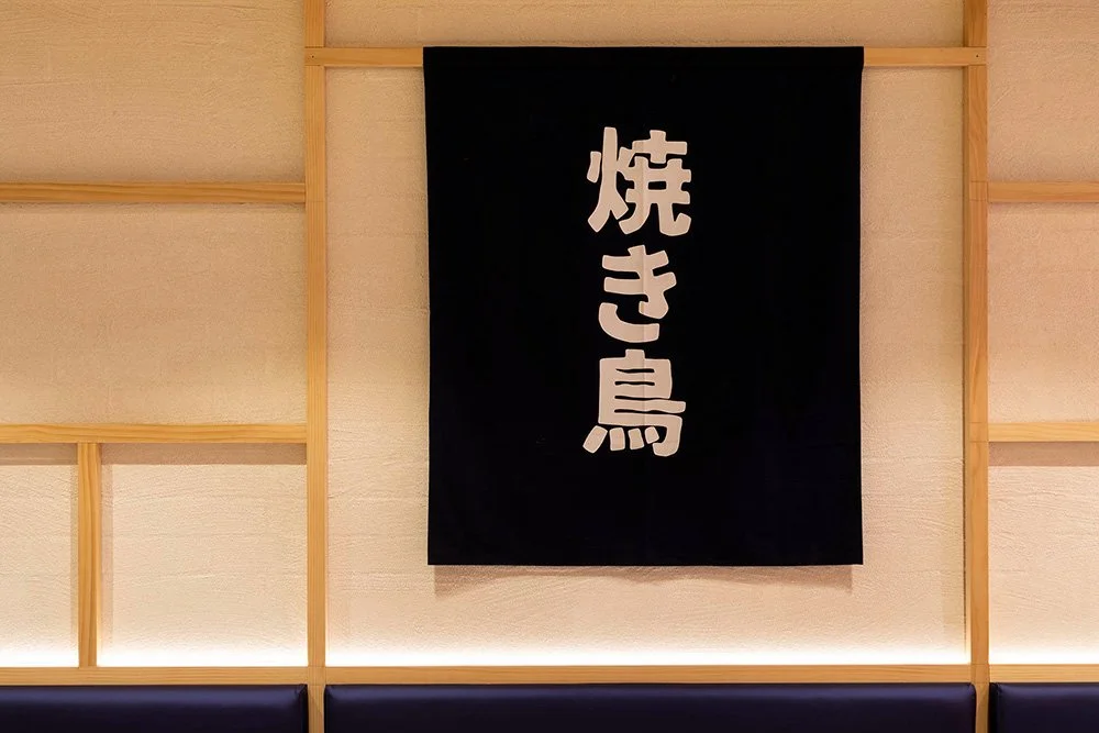
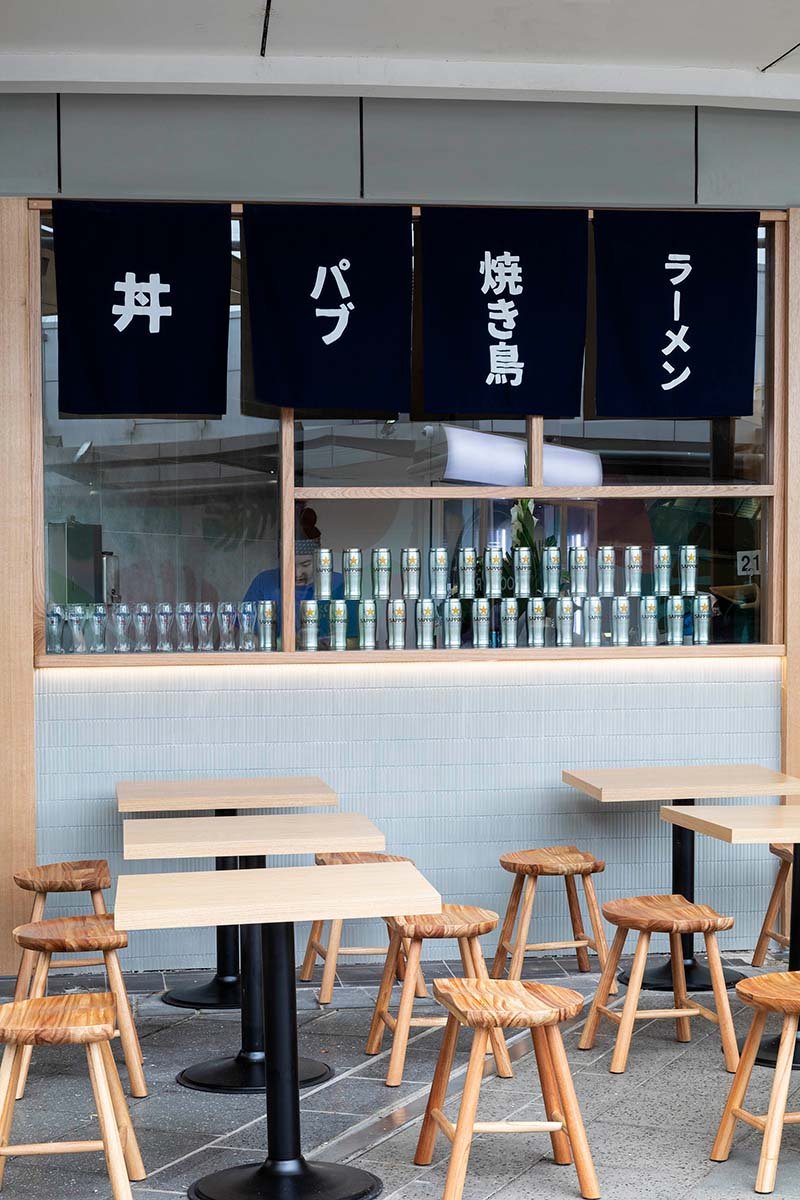
The logo design for Kou Ramen is inspired by the traditional seal found in the historic Japanese era. Using a bright red, it alludes to Kou Ramen’s specific cultural offerings and the signature dish. A simplistic approach to colours, shapes, and branding elements on the graphics is implemented so that the brand is true to its simple intention of bringing quality and homely dishes. Kou Ramen reflects the restaurant’s intention of providing a place for patrons to enjoy and experience a warm welcoming atmosphere similar to the times when you were invited over to your friend’s house for dinner.
Location: Westpoint Centre, Blacktown, NSW
Project Type > Interior Design, Branding Design