
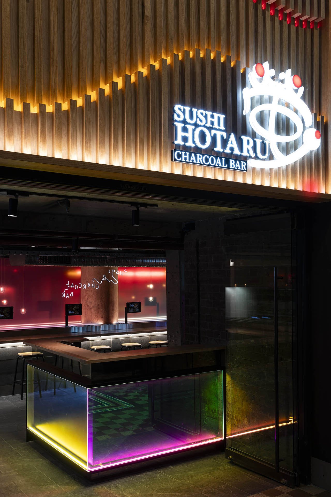
Sushi Hotaru Charcoal Bar
Inspired by “Hotaru” as the concept, the brand is adapting to the city hustle and the dynamic beauty of Sydney. Sushi Hotaru is a well-known sushi train restaurant amongst locals and visitors alike that offers a unique way of eating sushi. The logo itself is the representation of “Hotaru” in Japanese Kanji which gives a strong sense of Japanese culture. The most recent Sushi Hotaru Charcoal bursting through the back of QVB’s lower floor shows a bold statement in one of Sydney’s most iconic buildings.

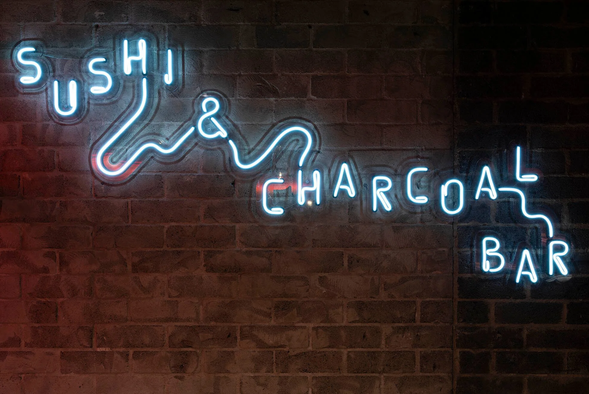
To represent the concept of the glowing flight paths of the firefly with the moving lights in Tokyo’s busy night streets, we created the brand to have a vibrant, eccentric, and bustling personality that makes the brand more standout, with the combination of connecting lines to mirror the business journey of Sushi Hotaru, dots by dots, bits by bits, and spreading their lights from different food categories.
The brand’s slogan is “A vibrant Japanese Experience”, it’s where the social media ideas came from where we are focusing on the foods, beverages, and not to forget the yakitori which became the highlight of this place. To create a high-contrast, warm-toned, and connected with the whole brand’s concept, we decided to play with the glow-in-the-dark interior and neon lighting that makes the whole brand more eye-catching. We also came up with several videos to inform people about our restaurant, and one of the videos during the opening was Hotaru Hunt, a challenge to make people find out where the location was.

Sushi Hotaru Charcoal Bar QVB
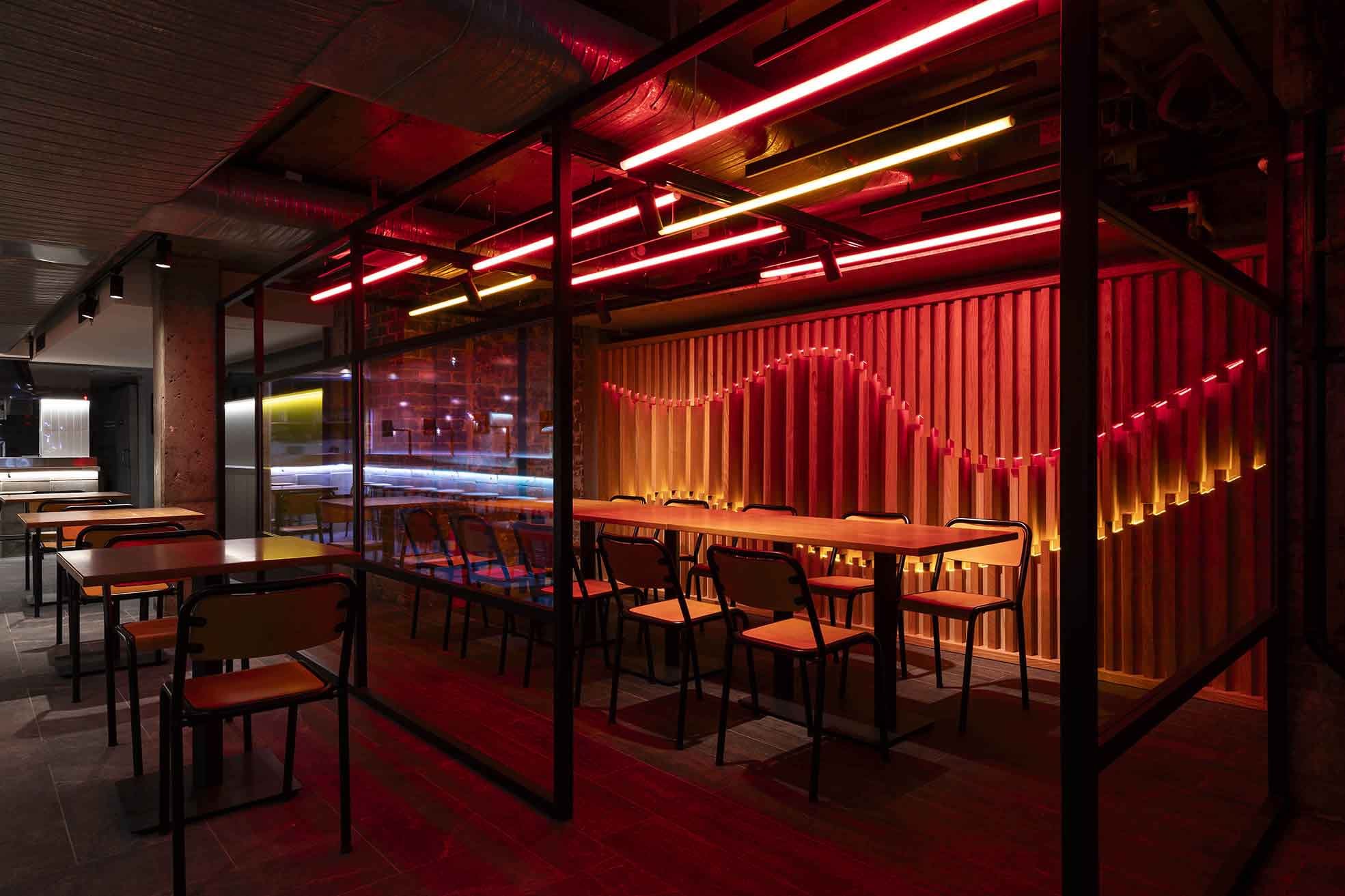
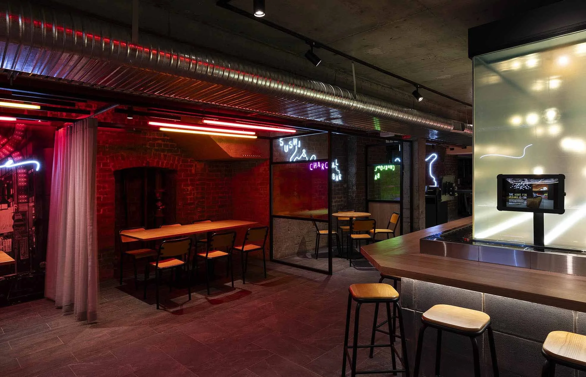
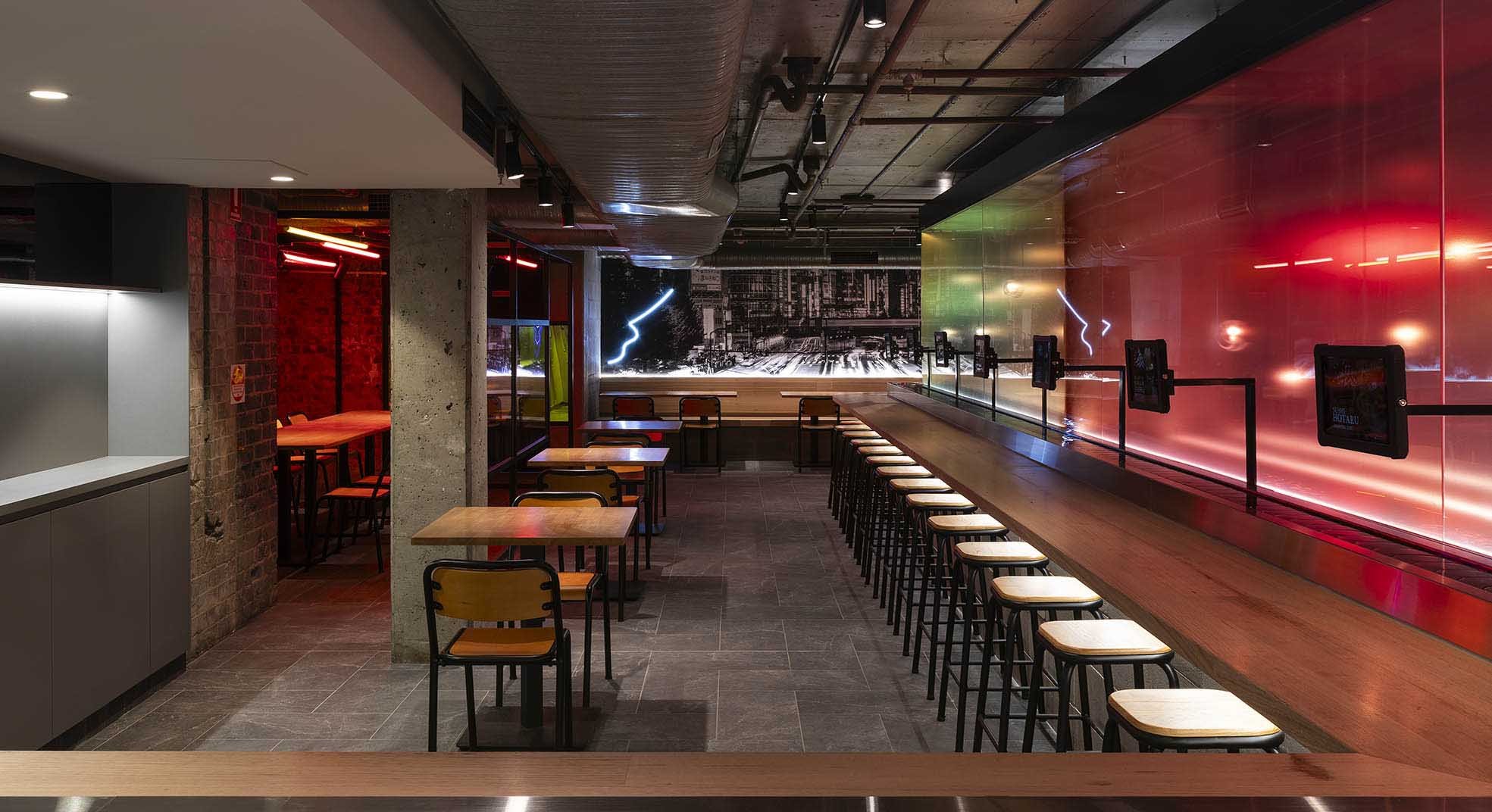
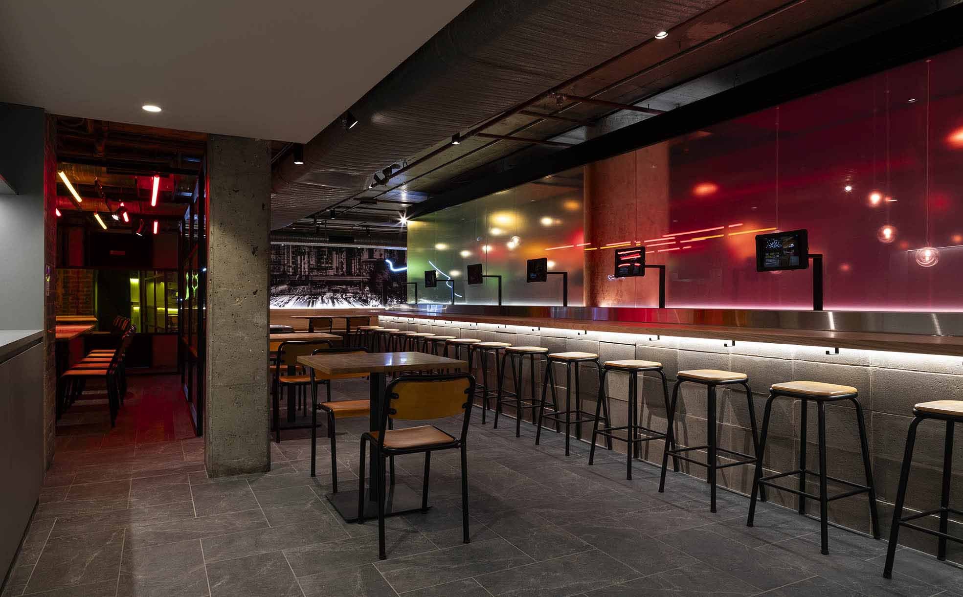
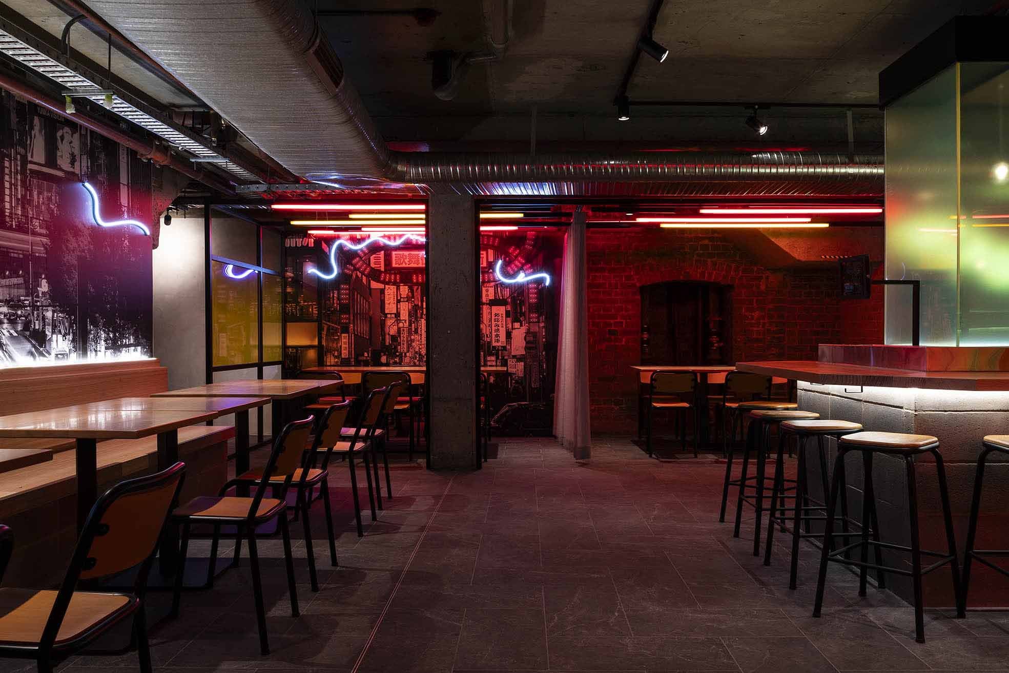
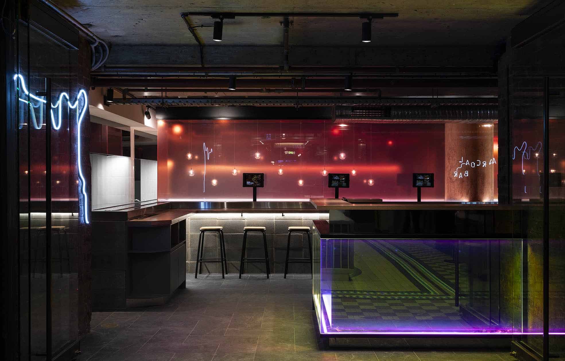
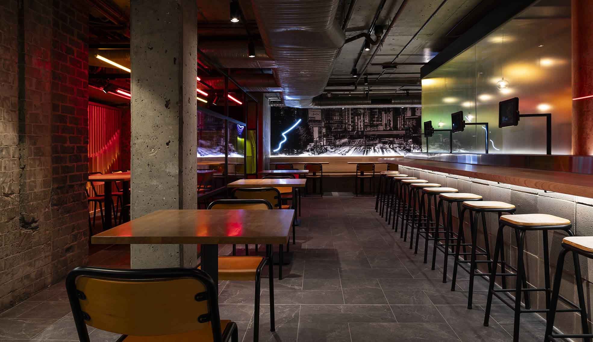
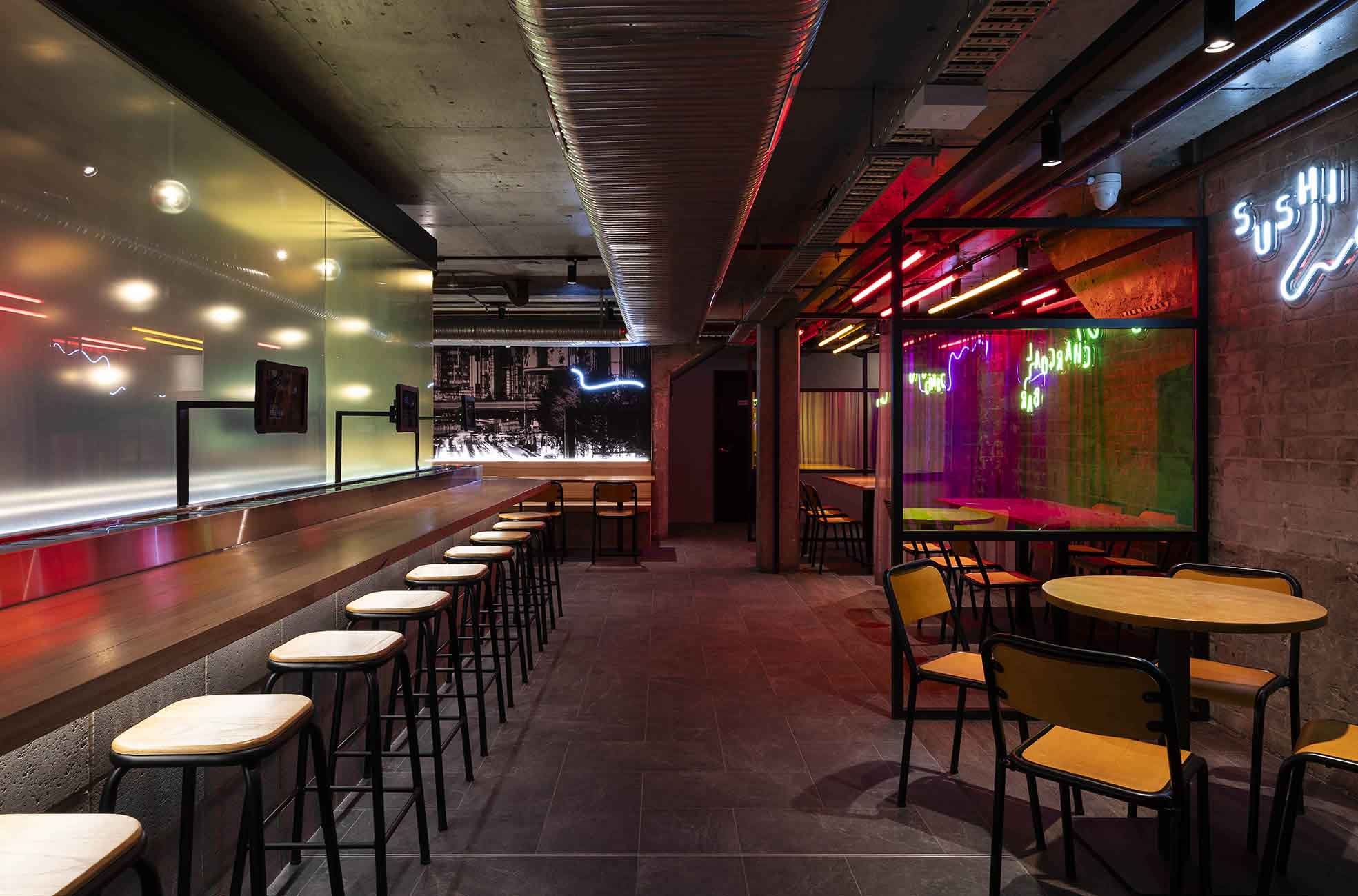
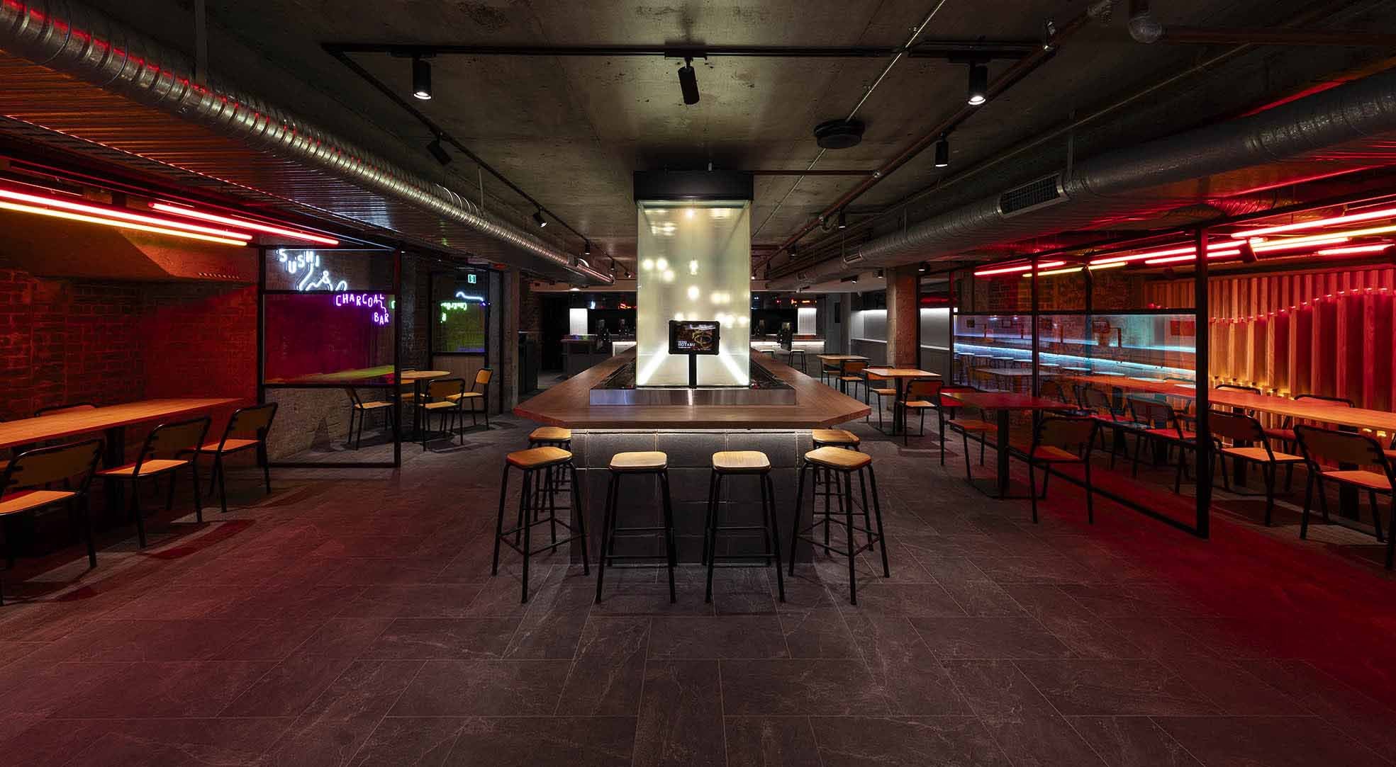
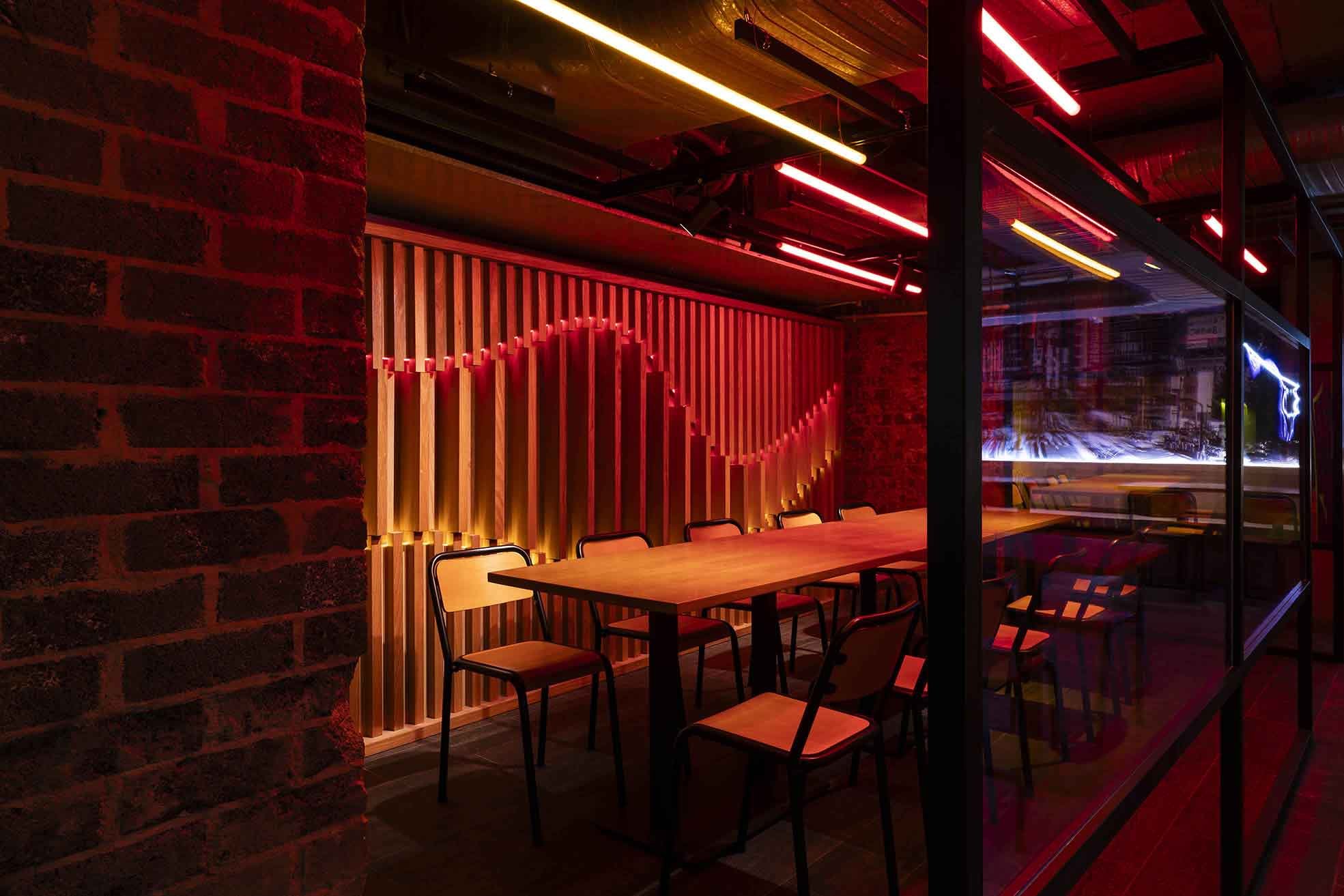
While located in a iconic building, the site within QVB led to numerous challenges during the design phase. To respond to these challenges effectively, we capitalized on the wall space, strategically suspending light and LED signage to draw attention away from the lacking volume. Creating floor-to-ceiling graphic walls and using vertical, illuminated timber panels in semi-private dining areas generates the illusion of taller ceilings, effectively creating a more spacious design. Additionally, to convey the urban cityscape of Tokyo, we create the open ceiling design and raw column structures. Red and yellow neon tube lights run along the ceiling, reminiscent of car light trails of long-exposure streets.
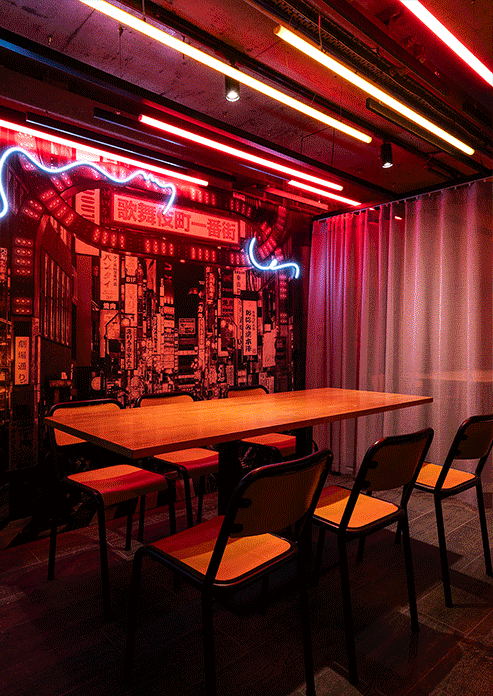
To keep the historical touch of the building, we decided to unearth the building’s materials. With the use of sustainable materials, such as the dining area partitions and sushi train benchtops use robust masonry blocks and timber materials, they are capable of withstanding the day-to-day functions of the restaurant, eventually blending into the rustic nature of the existing site conditions over time.
To bring our concept to life, within the shopfront, layered timber slats sit along an undulating path, dazzlingly lit up with luminous colors. Inside, the seating area is illuminated with delicate hanging glass orbs. Suspended at varying heights, these lights replicate the ethereal glow of the firefly, while the graphic wall components imitate their playful movements. Interacting beautifully with the reflective surfaces in the restaurant, the lights bounce off dichroic film and metallic overlays. Shifting as customers journey through the store, they’re treated to a captivating show of refracting lights.
Sushi Hotaru The Galleries
Located in the heart of the Sydney CBD, our mission is to bring the casual Japanese street eatery experience, combined with a playful array of Japanese graphics and neon signs that adorn subtly textured walls and surfaces to bring a lively and authentic atmosphere to Sushi Hotaru.

Inspired by this project?
This space was designed by Vie Studio. Explore how we approach retail, hospitality, and corporate interiors, and learn more about the studio behind the work.