
Top Impression Bakery, Sydney
Top Impression Bakery was established in Wolli Creek in 2015. With a wealth of baking and managing experience, they have created something more than a bakery, modernizing the croissant by experimenting with inventive fillings. Top Impression strives to be innovative, taking your appreciation for baked goods to the next level. The brand’s name itself has a special meaning to create a strong and long-lasting impression in one’s mind ever since the first try. Additionally, Top Impression has various branches across Sydney where it has a different color palette for each places that is inspired by the product’s flavour.
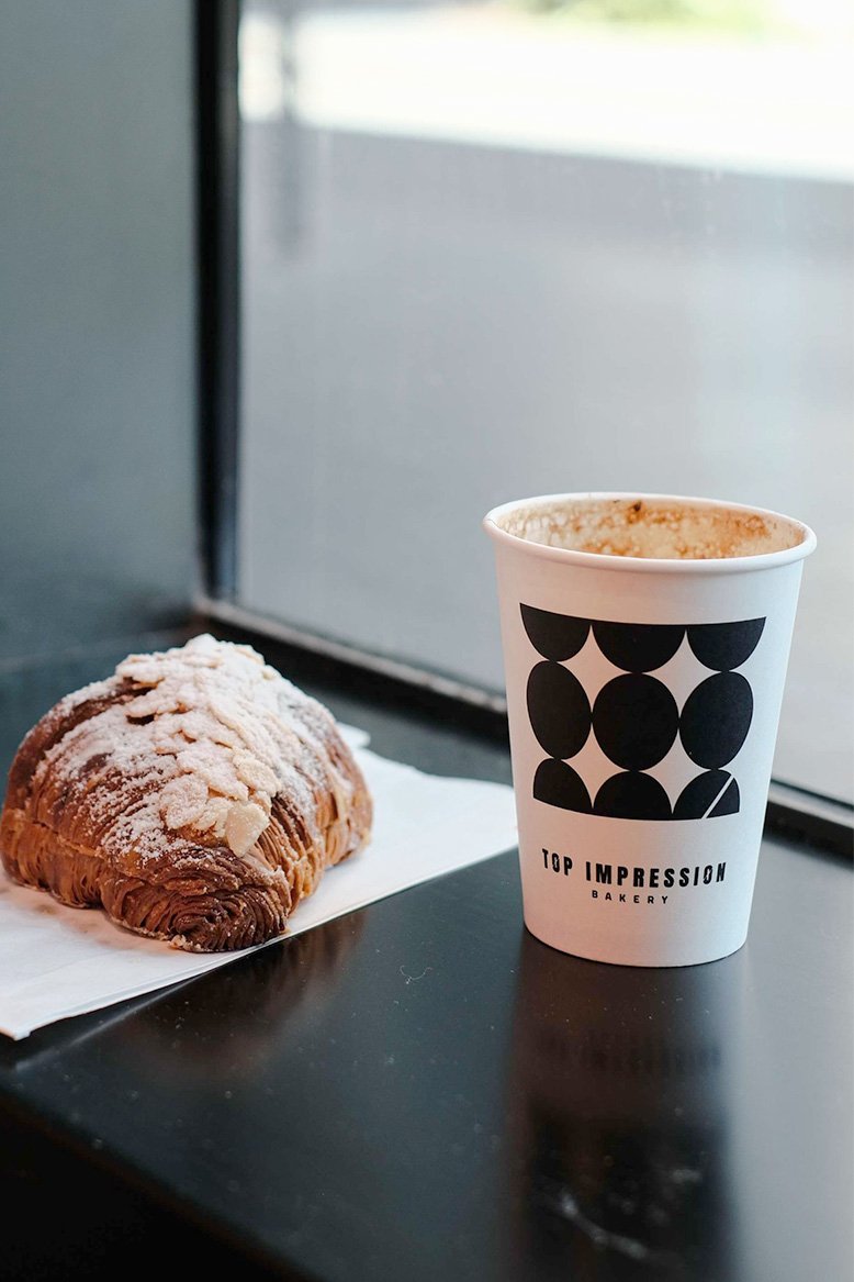
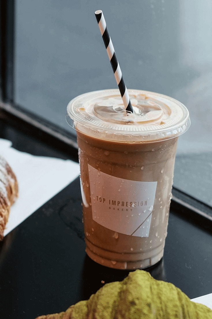
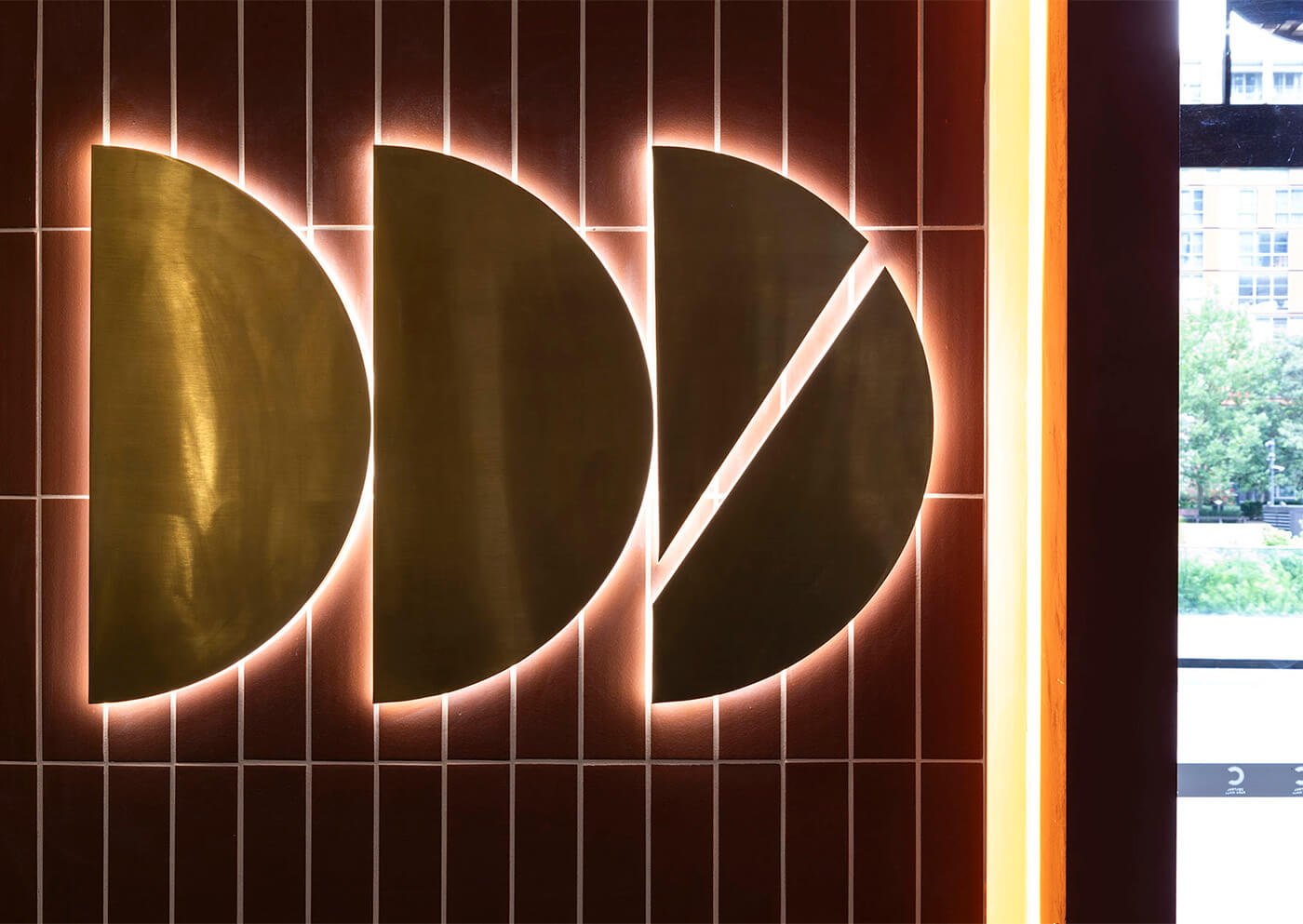
The re-branding for Top Impression comes from the “inspiration” concept where the brand wants to inspire everyone through daily intake of bread and coffee. The logo itself has a line on the “O” word mirroring the aim to leave a mark in everyone’s heart. Additionally, the brand’s pattern is derived from the shapes of the products, with an iconic pastry cut at the very last piece. The pattern is in geometric form, bold and loud, to create a strong visual impact. We created 5 different patterns to emphasize their famous products and the processes that they did to achieve the best croissant, we named it croiss-section, laminate, outside the danish, hot off the tray, and dough-vide. All these patterns can be seen throughout the cup’s packaging, paper bag, and interior graphics across all branches. To further emphasize the brand’s aim, we decided to keep the giraffe as the brand’s mascot as it represents uniqueness and stands out from the crowds.
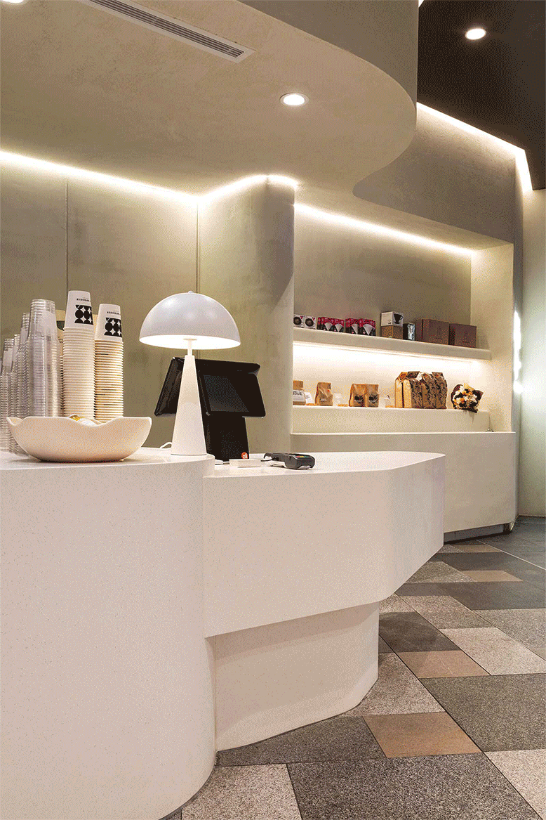
To create a stronger brand image, we collaborated with the interior team to create unique and different concepts for each branch. We chose to use different hero colors for each place that derived from the brand’s color. We also incorporate the bold, and geometric shape throughout the place. Not to forget, we also include the special pattern, and mascot to let people recognize the place easily.
Top Impression Bakery Central Park
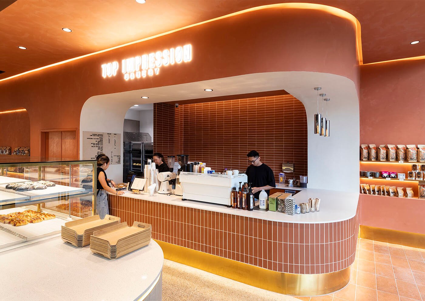
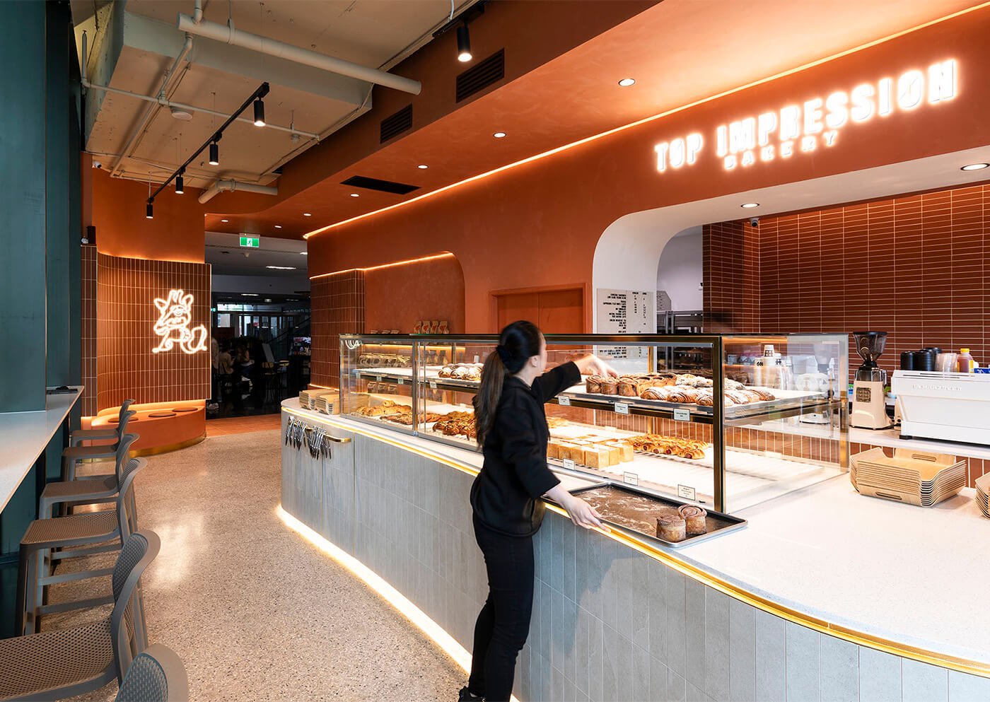
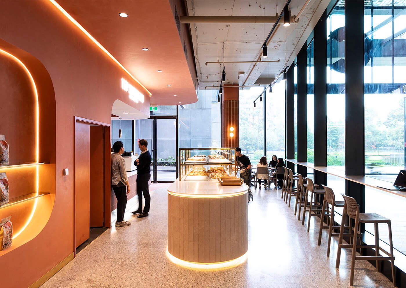
Located in Central Park, the concept for this branch is inspired by the mascot which is a giraffe that represents its intuitive and adventurous by incorporating the untamed beauty of Savana, Blending the majesty of the wild with contemporary natural comfort. To enhance this concept, we decided to use cinnamon color as the hero with blending, distinct, and earthy tones of materials.
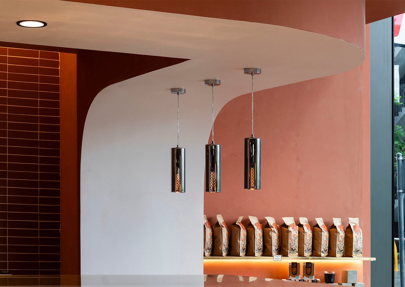
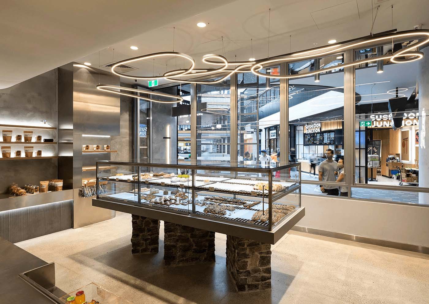
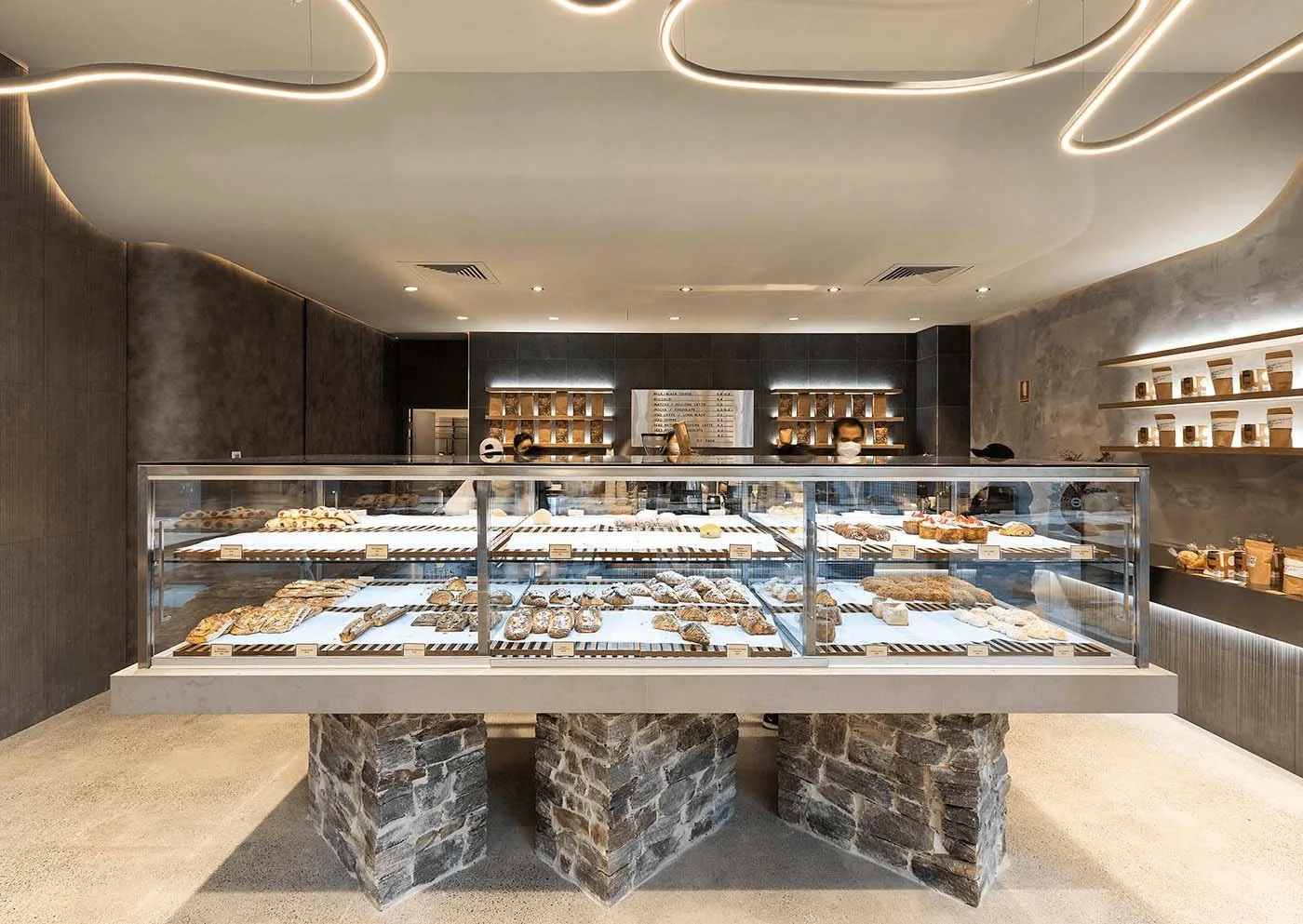
Top Impression Bakery Miranda
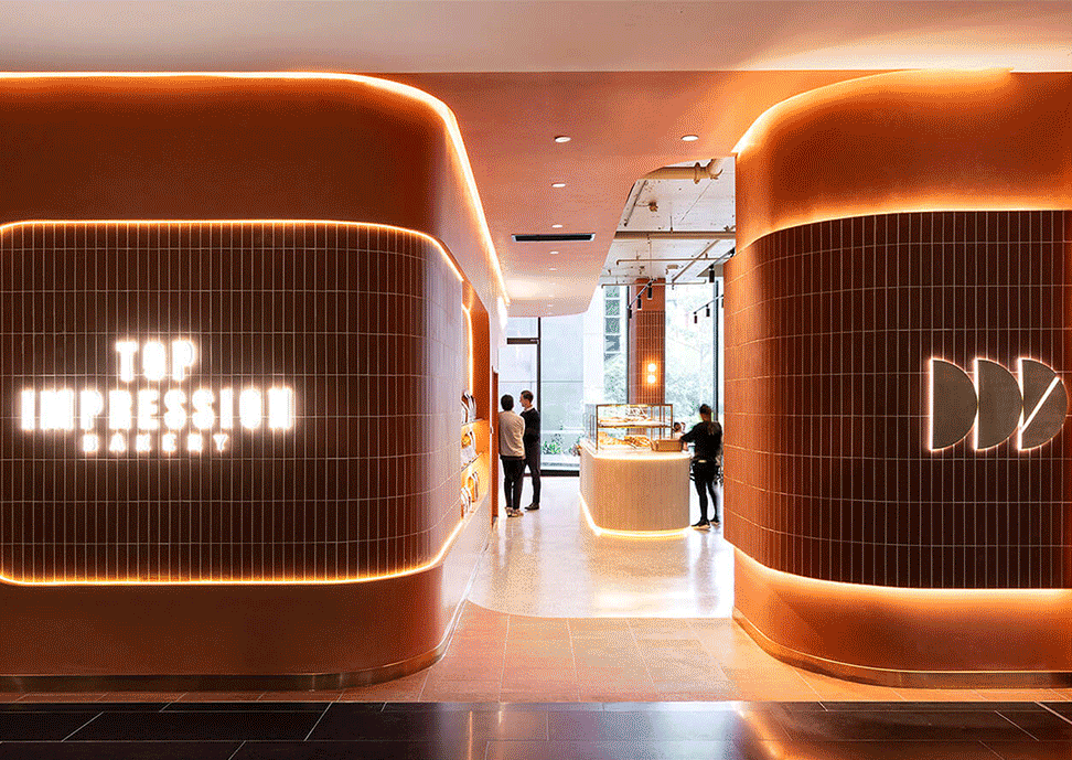
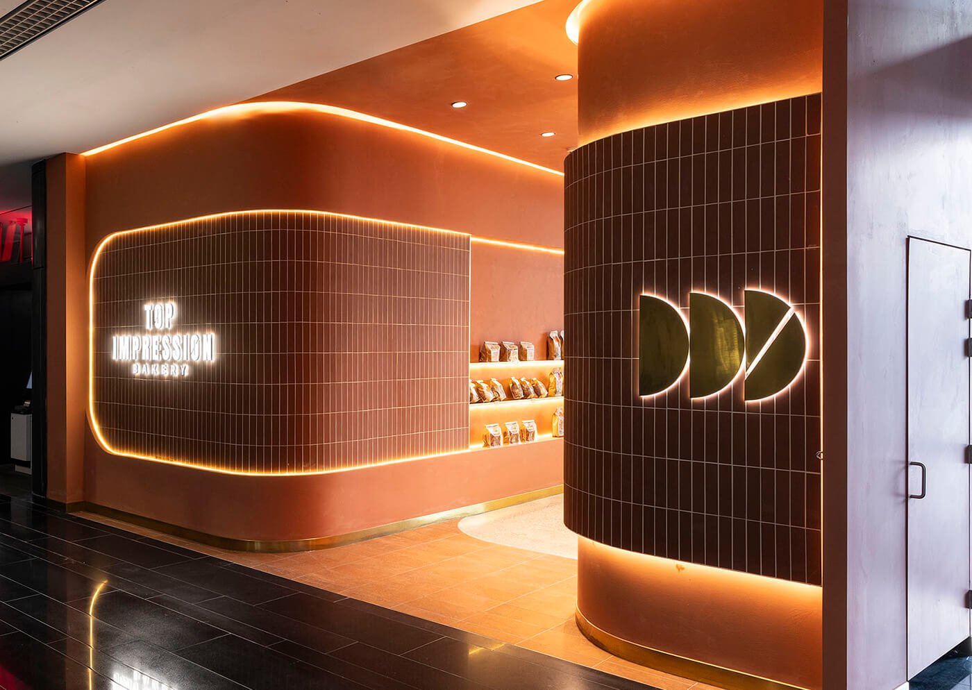
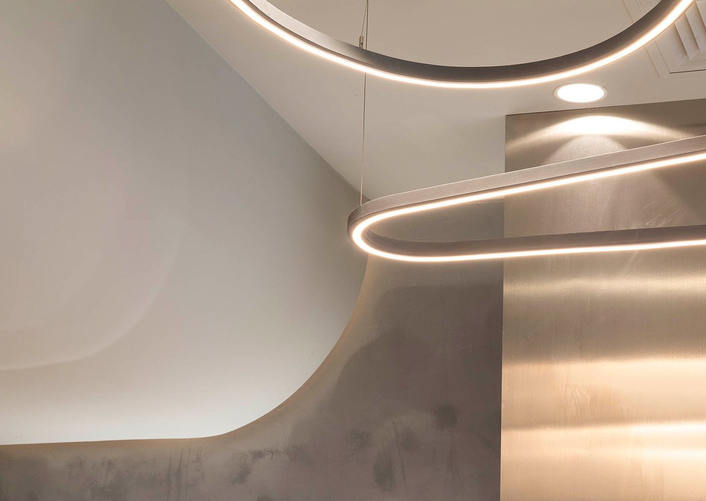
Located at Westfield Miranda. The hero color for this branch is taro color combined with a rough textured wall and layered shelf to give a textured and minimal ambiance but still have a hint of uniqueness. To further add a modern detail, we created a smooth corner, a geometric shape LED light for the logo, and a curved ceiling with LED light around.

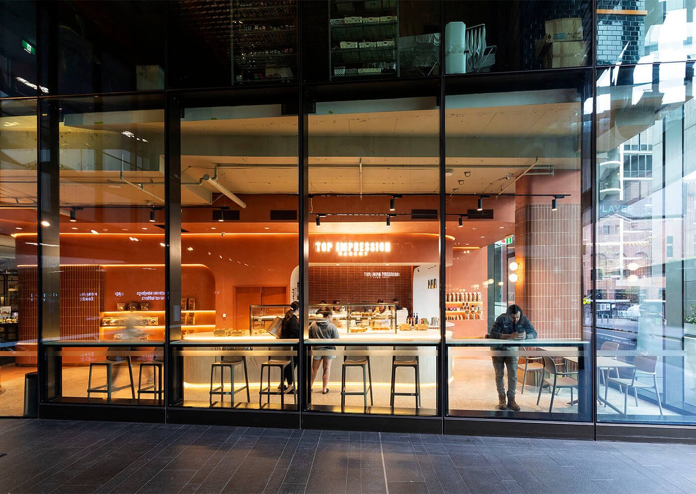
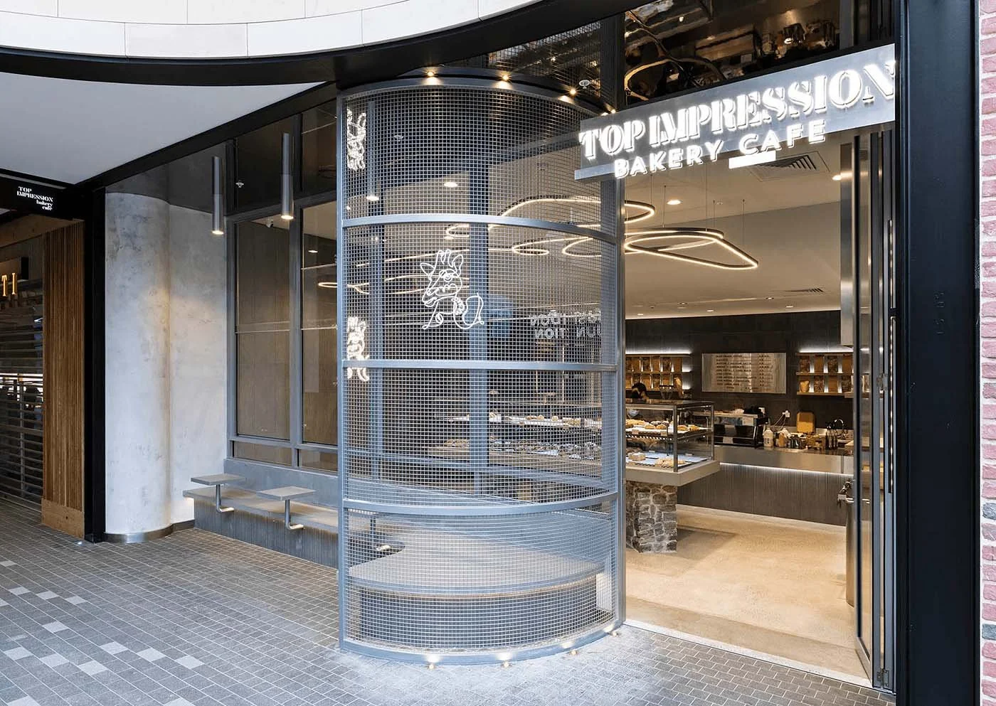
Top Impression Bakery Rhodes
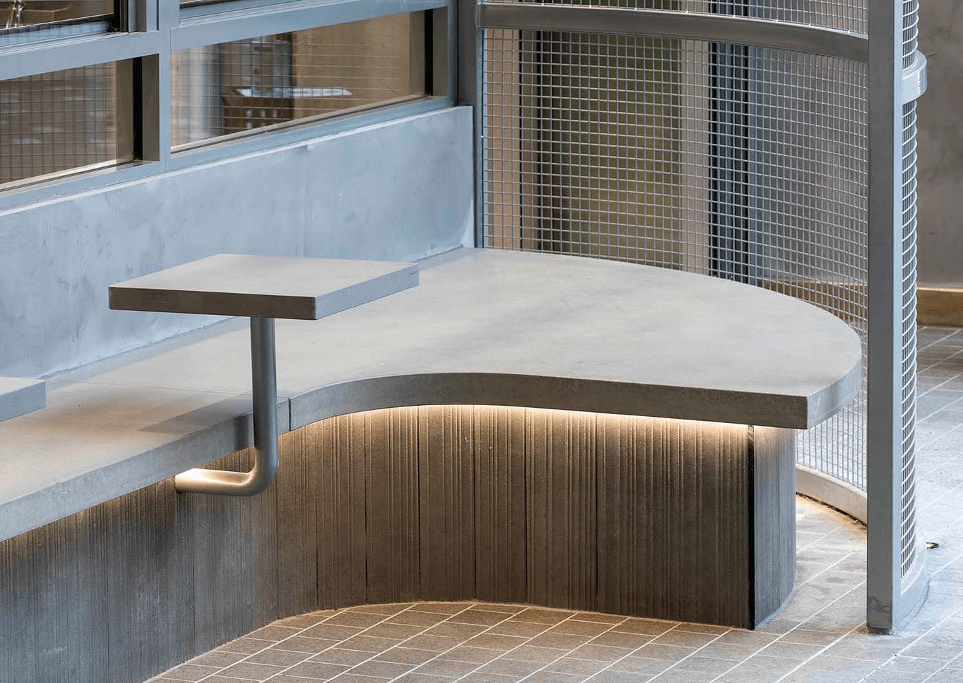
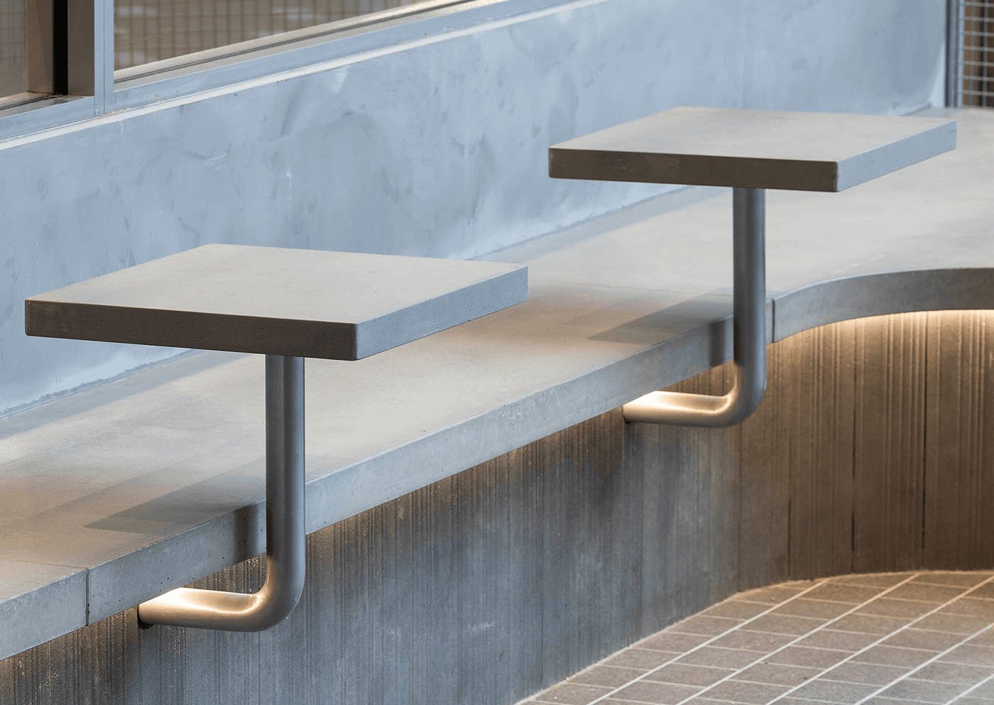
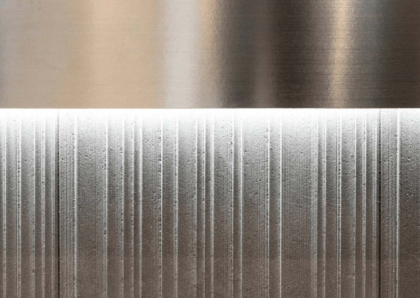
Located in Rhodes Central, where the boundaries between the indoor and outdoor settings are blurred, this branch articulates a narrative between its industrial past and the notion of synesthesia. The design curates a palette of juxtaposing raw and clean materials, sparking a visceral feeling that connects deeply with memory and culture. Through raw materiality, where textures are used to bring emphasis to key areas of the interior and pay homage to the site’s industrial past., Top Impression conveys the same notion through the alcove-like ‘outdoor’ seating to complement the display, smooth steel finishes, and monotonous gray textured tones serve to intensify the sensory experience without being excessive.
Inspired by this project?
This space was designed by Vie Studio. Explore how we approach retail, hospitality, and corporate interiors, and learn more about the studio behind the work.