
Apstar Lighting, Leading Glow
Emerging as a prominent new brand in Australia, Apstar Lighting specialises in emergency lighting solutions. Committed to innovation, their goal is to provide cutting-edge products that illuminate their customers during their time of need. With a strong emphasis on technology, the concept draws inspiration from the intricate design of electrical circuits, symbolising the brand’s reliability and professionalism.
As a new emergency lighting brand in Australia, Apstar Lighting sought to carve out a distinct identity within a competitive market. Our brief was to create a unique brand that embodies their core values of technological advancement, professionalism, and reliability.
Unlike their competitors, Apstar Lighting has a dedication to technological advancement. Leveraging this strength, we infused the brand with digital elements and icons, reflecting their commitment to innovation. These themes permeate all facets of the brand, extending to the packaging design, instruction manuals, and other collateral. The ultimate goal was to establish Apstar Lighting as a leading brand, attracting customers of different demographics and earning their trust as one of Australia's foremost lighting brands.
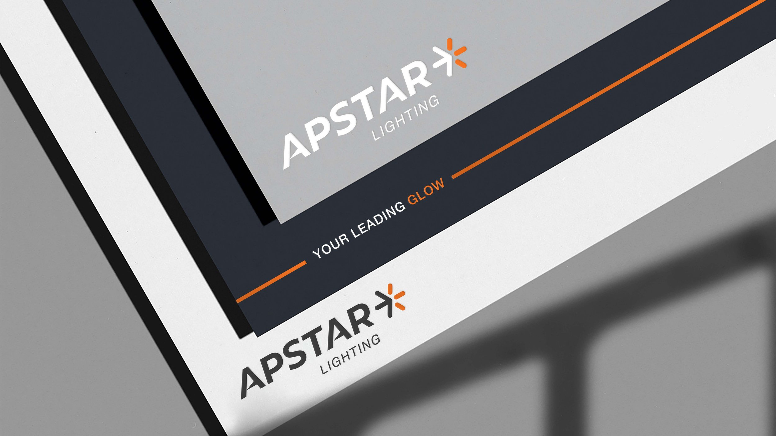
To ensure the completion of an electrical circuit, every component must function properly. This principle inspired our branding concept and inspired our approach to the brand’s logo. Inspired by the triangular shape formed by a light piercing the darkness, we incorporated a slanted edge to the crossbar of the ‘A’. The logomark takes its shape from a star, but the use of colour transforms the star into an illuminated arrow, representing direction and clear guidance.
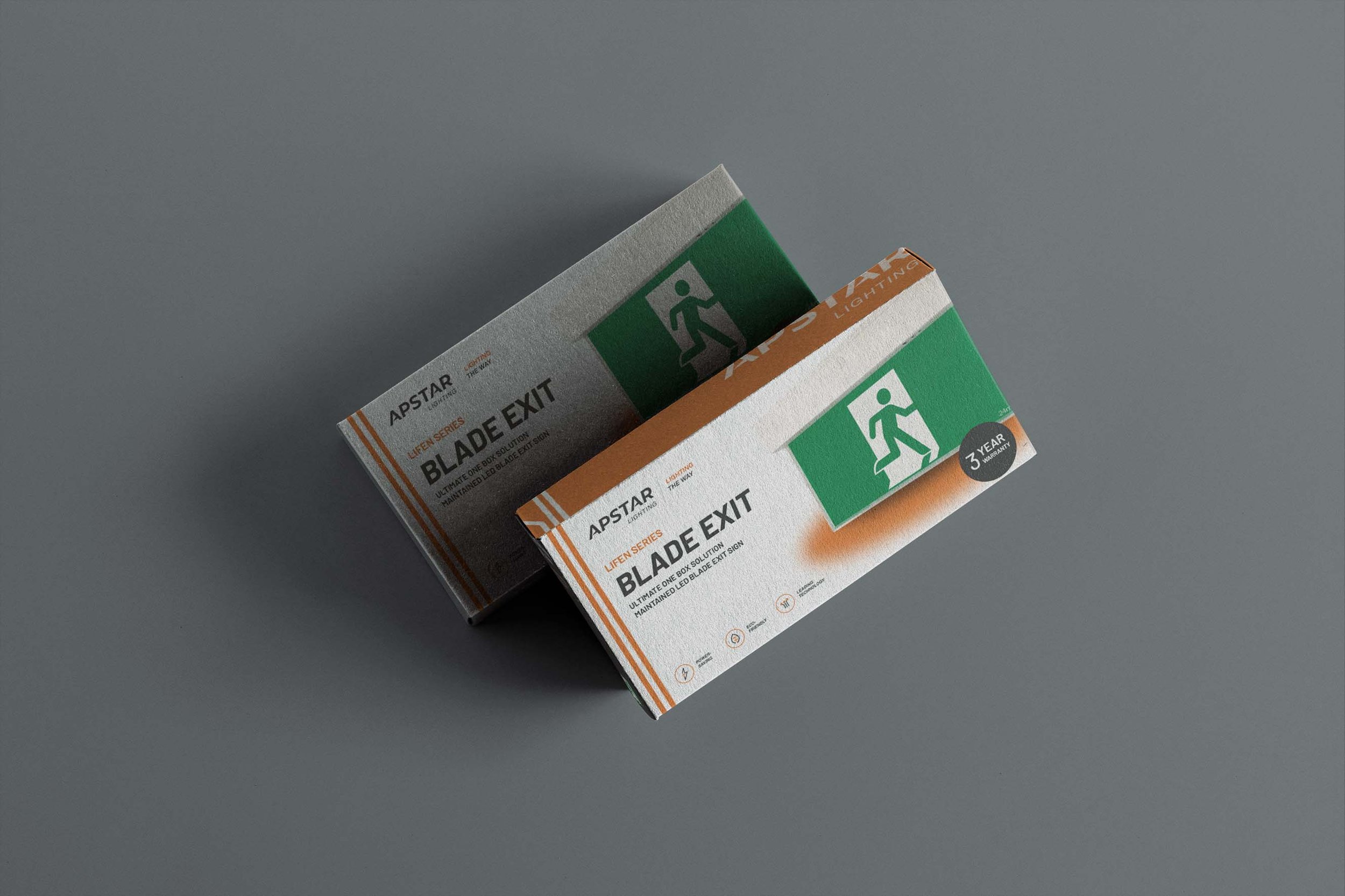
The brand exudes professionalism, and dependability through a colour palette of simple monochromatic tones, while the bright orange communicates their fresh perspective. Mimicking the trajectory of light in the darkness, we strategically utilised italicised typefaces, creating a sense of energy. Additionally, line elements enrich our branding across various applications, representing guided paths out of the darkness.
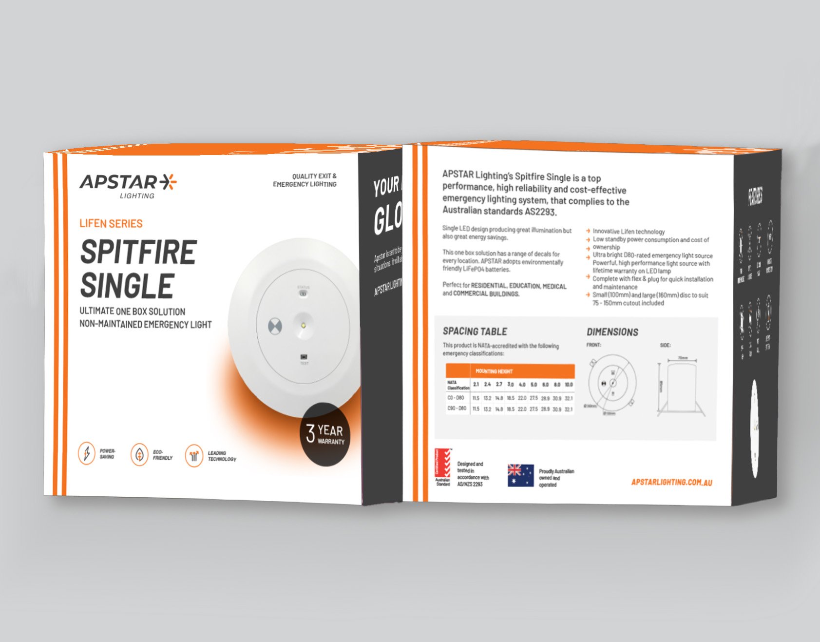
This cohesive branding system extends to our packaging, the core of the brand. Here, each branding element is developed to add a further layer to the brand’s narrative; the line element connects the different faces of the packaging, subtly encouraging users to engage with all sides. The orange is cleverly incorporated into the front face, immediately differentiating Apstar Lighting through colour alone. The custom icons work in tandem with the brand mark; each icon expertly weaves in an orange arrow, showcasing the brand’s attention to detail.
The process of creating the Apstar Lighting brand involved careful consideration of multiple crucial aspects. As they specialise in emergency lighting products, we needed to maintain a clean and accessible design, while crafting a unique position for the brand. Our strategy to achieve this was to zoom into the details; the logo, logomark, and icons are straightforward, but highly considered. Paired with a meaningful slogan, the result is a brand that is memorable and captivating, appealing to a wide audience with universal appeal.